Part 77- CAESAR Mission Landing Location Target Anomaly

CAESAR (Comet Astrobiology Exploration Sample Return) is a proposed sample-return mission to comet 67P/ Churyumov-Gerasimenko. In December 2017 CAESAR was chosen as one of the two finalists for NASA’s New Frontiers program, mission 4. This meant further development of the mission concept would be funded. If accepted in the final round, it would launch in 2024 and return in 2038.

In January 2018 a presentation was given to the Small Bodies Assessment Group (SBAG) giving an overview of the CAESAR mission. SBAG reports to NASA.

Here’s a link to the presentation, entitled, CAESAR Project Overview

https://www.lpi.usra.edu/sbag/meetings/jan2018/presentations/3-15pm-Squyres.pdf

On page 47 of the overview there’s a close-up photo of the comet with the proposed landing site marked with a yellow circle. The area chosen is part of the region named as Ash. The yellow circle is marked on a clear OSIRIS camera photo. However, that photo is mirror-flipped. Many OSIRIS camera photos are mirror-flipped because the OSIRIS Narrow Angle Camera (NAC) and Wide Angle Camera (WAC) share a lens. A mirror is used to direct the image to one or other of the two cameras. Software is then used to flip the photo back to its true non-flipped orientation. Nevertheless, some of these photos remain in the OSIRIS archive as unflipped and several have been used inadvertently in peer-reviewed OSIRIS papers on 67P. I have pointed this out several times, both on the Rosetta blog and on Twitter.

This uncorrected mirror-flipping has the potential to cause confusion further down the line when interpreting any such image and its attendant data.

Here is the mirror-flipped photo on page 47 of the Project Overview (yellow circle on the right) along with its correct counterpart (yellow circle on the left, annotated on a similar view). The coloured dots are fiduciary points, used to show up the mirrored image. The originals are further below.The mirror-flipped CAESAR photo shows the landing site biased towards the right of a smooth area of the comet. This area has a characteristic shape defined by an obvious perimeter line of cliffs. As with all the smooth areas on 67P, it is (or should be) highly recognisable to scientists working on the comet. One should be able to see at a glance that the photo is flipped and correct it.

The mirror-flipping error seems to have resulted in another photo on the following page (page 48) of the Project Overview showing a completely different location for the proposed landing site. This photo shows a target which is supposed to be the same location as the yellow circle on page 47. However, the centre of the target is at a location that’s over a kilometre from the yellow circle, which means it’s at least a quarter of the way across the 4km-long body lobe. A possible reason for the misplacing of the target might be that the yellow circle in the page 47 photo is already biased in that direction (roughly east) by about 300 metres due to the mirror flip. However, the page 48 location is biased a further 1000 metres or so in the same direction. It’s no longer in that smooth area with a well defined perimeter and is now in an identifiably different area with different surface morphology (next to the big crater). The total distance between the (correctly flipped) yellow circle and the target centre is about 1.35km.

Here’s a close-up of the relevant area on the page 48 photo, followed by an annotated version of the same photo taken from the Rosetta Image Archive. The annotated version explains why the page 48 version shows the wrong location. Page 48 in the Project Overview linked above has the full-size photo although it’s not much bigger and not needed for context. A close-up view of the two locations together, and from a more favourable angle, will follow further down.

Top Photo: ESA/Rosetta/MPS for OSIRIS Team MPS/UPD/LAM/IAA/SSO/INTA/UPM/DASP/IDA/CEASAR

Second photo and its original: ESA/Rosetta/MPS for OSIRIS Team MPS/UPD/LAM/IAA/SSO/INTA/UPM/DASP/IDA/A.COOPER

Here are some closer views. The first pair (annotated and original) is the closest and highest resolution of all photos in this post. However, the landing site circle from page 47 is slightly obscured and the smooth area is still rather foreshortened. Overhead shots are hard to come by for this area when well illuminated because Rosetta orbited along the terminator for much of the time although some overhead shots do exist. The second pair has a scale showing that the two locations are at least 1.35km apart and probably a little more due to foreshortening. The left hand photo of the second pair is left unannotated and gives a slightly different view:

Copyright ESA/Rosetta/NAVCAM – CC BY-SA IGO 3.0/A.COOPER

ESA/Rosetta/MPS for OSIRIS Team MPS/UPD/LAM/IAA/SSO/INTA/UPM/DASP/IDA/A.COOPER

CONCLUSION

It goes without question that two of the people who would be most enthusiastic about returning to 67P and continuing the data gathering would be myself and Marco Parigi. After all, we lobbied hard to put the Rosetta orbiter into hibernation through to 2020 and in a quasi orbit (inclined heliocentric orbit) at a few thousand km distant from 67P to keep it safe. It would then have returned to 67P naturally at the opposite heliocentric orbit node and at the ideal wake-up time with an almost zero delta V budget. See Part 59 of this blog:

https://scute1133site.wordpress.com/2016/09/01/part-59-the-dare-devil-apis-flyby-escape-and-2020-reacqusiton/

So Marco and I have high hopes for CAESAR. But this landing site location anomaly and mirror-flipping a photo without realising it makes for a disappointing start. The CAESAR team needs to get really familiar with the regions and the morphology- and preferably do so using the actual photos. I would recommend avoiding use of the shape model as a tool of first resort. In our experience, the photos, when scrutinised in their hundreds and even thousands, give a knowledge of the morphology that is second to none. This resulted in our bringing attention to regional border errors in a regions paper published by the OSIRIS team. An erratum was published as a result.

Here’s Marco’s latest blog post (published the same day as this blog post) explaining the movement of the Anuket boulder:

http://marcoparigi.blogspot.co.uk/2018/02/anuket-boulder-move-timing-and-cause.html?m=1

FUTURE POSTS

The stretch blog has been on a hiatus but is far from finished. The northern hemisphere layer delaminations and slides are now fully understood but only half are documented in the 77 parts published thus far. The rest are in note form and will be published slowly in due course. Regarding the southern hemisphere most of that is understood too but with only a low-resolution understanding of Geb and part of the neck. This is mainly owing to the lack of high res photos for these areas. However, since all layer slides, right down to the 50-metre scale were found via the predictive process of establishing the tensile force vectors of stretch, one can piece together the Geb narrative via the slides in the adjacent regions of Bes and Sobek.

Part 76- The Supposed New Crack in M. R. El-Maarry et al. (2017) is Not New


Photo credits listed below.

UPDATE 12th April 2017

The lead author of the paper, M. R. El-Maarry, kindly responded to my email notifying him of this post. He gave permission to attach his reply here so I’ve put it at the top as I did for other similar lead author responses. The original post starts after “///END”

Dear Andrew,

Thank you for your email. I have have gone through your blog and I am as always impressed with the amount of effort you put into your analysis.

With regards to the second fracture in the neck you refer to, I remain skeptical about your results, as well as mine.  I have INDEED taken account of geometry and illumination conditions when looking at all the changes in this study. Even after looking at your thoughtful analysis, I am still not convinced that the fracture was pre-existent.

My geologic interpretation (and i say “interpretation” because this means you can certainly have another interpretation) remains that this fracture indeed formed or grew in size after perihelion.

I am not sure if you have the paper or not, or are just relying on the figures but I did EXPLICITLY say in the paper’s main text that this was a “possible development of new fractures….” because despite my conclusion, I wanted to leave the door open for further analysis/scrutiny from me or others (if you have the paper, please check the main text, otherwise I can send it to you). It is unfortunate from my side that this is not conveyed in the figure caption as well, nor was it expanded upon in the supplementary material. I have no problem accepting the validity of your interpretation, even if it doesn’t match mine.

Therefore, I do not consider this an “error” (nor would the journal consider it as such I believe) and I would encourage you to submit your findings, and I can promise you that if I got the paper as a reviewer I would never reject your analysis because it contradicts mine. I believe this is how science should progress so publish your (excellent) work and let the community decide : )

Apart from that, It looks from your blog that you have not read the paper’s supplementary material so please if you do not have access to the journal , just let me know and I can send you a copy. There we have reported on the movement of the small boulder close the larger crack, which you show in the blog. I have also indeed noticed the changes in the first crack (the subsidence you refer to) but in the end I chose to highlight a few key changes in this paper. It is not meant to be a catalogue of ALL changes. Similarly, I also agree with you about the cliff collapse in the south but again the only reason for not including it was to highlight two other clearer examples, that’s all. In the end, there are bound to have been more changes in the south than the north, but we did not achieve the same resolution in the south pre-perihelion to carry a similarly detailed analysis. All we can say is that NO MAJOR changes to the landscape occurred (no creation of new large units, no significant changes to regional boundaries, no new large depressions such as Aten, etc), and that is the key result of the paper.

Finally, also in response to a comment you made in your blog, you mention that the June 2016 image is still not released; this is true for the database as a whole but ALL the images used in this study are indeed available for download. You should find the url link in the science paper acknowledgements. This is a Science journal policy so you have access to the study database if you need.

Please feel free to attach my response in your blog if you want. 

Best regards to you and Marco,

Ramy

///END

ORIGINAL POST

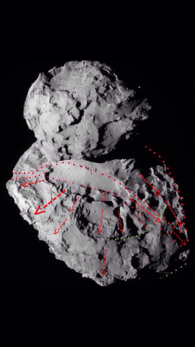
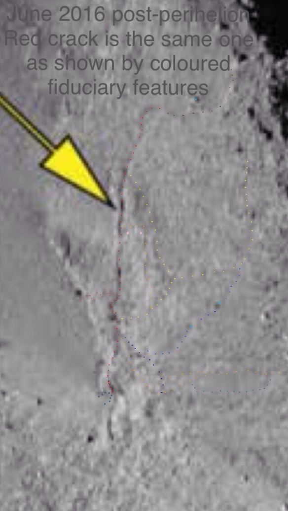
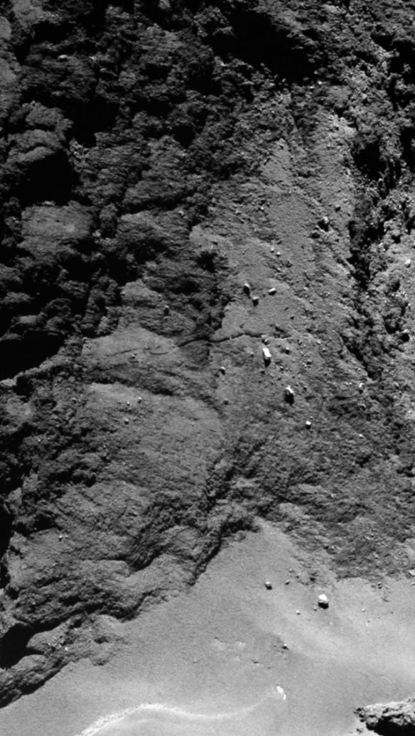
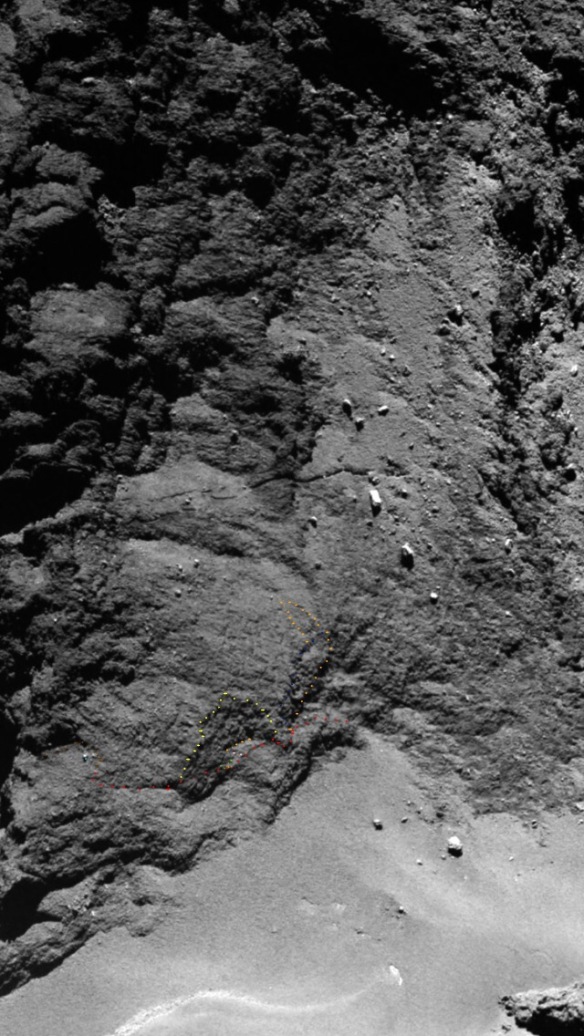
The top two headers are from figure 1B of the paper in the title and have added coloured dots. The dotted lines show identical fiduciary features. The crack is red and is the same crack in both photos. The big yellow arrow is original. The third photo has most but not all of the same fiduciary features. Full zoom and much patience is required for all photos in this post. 
Copyright for headers (photos 1 to 5):

Photos 1 and 3: ESA/Rosetta/MPS for OSIRIS Team MPS/UPD/LAM/IAA/SSO/INTA/UPM/DASP/IDA/A.COOPER

Photos 2, 4 and 5: Copyright: ESA/Rosetta/MPS for OSIRIS Team MPS/UPD/LAM/IAA/SSO/INTA/UPM/DASP/IDA/ M. R. El-Maarry et al. (2017)/ A.COOPER

Here are the first three headers reproduced with their originals for toggling between annotated and unannotated versions. 

INTRODUCTION

A 67P morphology paper by the Rosetta OSIRIS team was recently published in Science Magazine. It’s entitled ‘Surface changes on comet 67P/Churyumov-Gerasimenko suggest a more active past’. It’s by M. R. El-Maarry et al. and was published on 31st March 2017. Here’s the link (paywalled). 

http://science.sciencemag.org/content/355/6332/1392.long

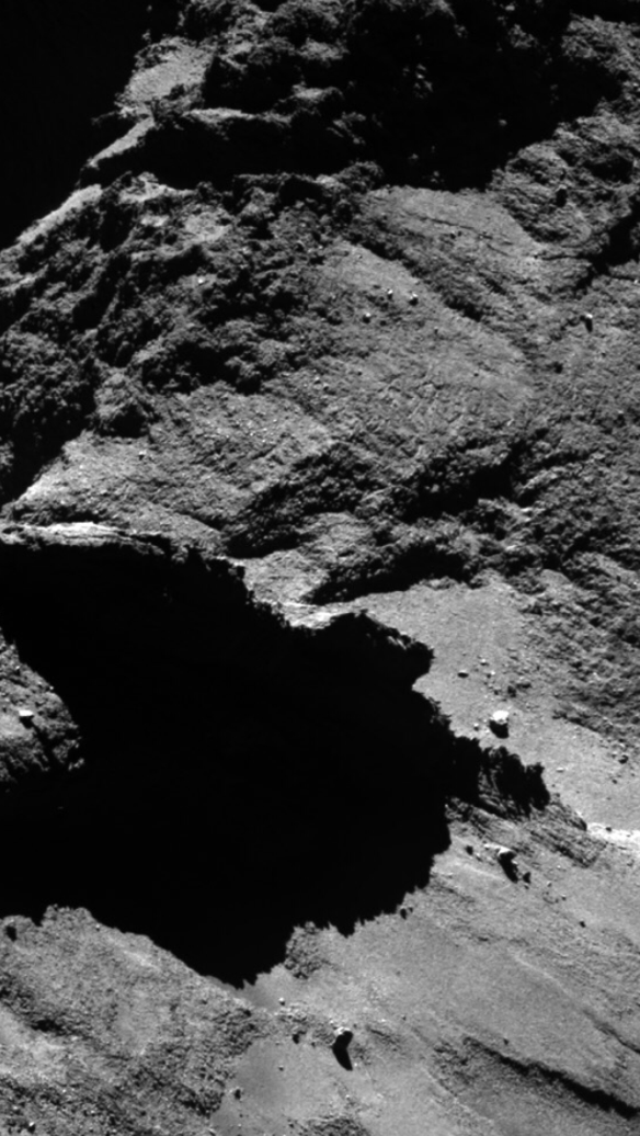
In figure 1B of the paper, two images of the neck in the Anuket region are compared. One is pre-perihelion, dated August 2014. The other one is post-perihelion and dated June 2016. This figure will be referred to a lot in this post. To be clear, stretch blog figures are photos with photo numbers and never called figures so figure 1B always refers to this figure in the paper in question. 

The authors state that a new crack has developed on the neck over perihelion because it appears to be evident only in the post-perihelion photo in figure 1B. However, it’s evident in the pre-perihelion photo as well and so it’s not a new crack. 

Both images in figure 1B are OSIRIS Narrow Angle Camera (NAC) images. The abbreviation, NAC, is used from here onwards. 

The caption for figure 1B states, “Extension of a preexisting fracture in the neck region and the development of a new one next to it.”

So this post is about the new crack which is to the left of the preexisting crack in figure 1B or below it if viewed in ‘upright duck’ mode with the head lobe above the body lobe and the neck vertical between them. In figure 1B, the head is to the right and body to the left with the neck going left to right. 

Some other photos in this post are in upright duck mode and so ‘vertical’ and ‘horizontal’ are used with respect to that orientation unless otherwise stated. 

The crack extension claim is also looked at briefly at the end. 

The penultimate sub-heading shows that this analysis of the supposed new crack is not new research nor some sort of learning curve adding to the sum of knowledge on the stretch blog. This (preexisting) crack is just one small part of what is a completely grokked area of the neck, much of it already blogged. This is why I could see the problem immediately on seeing the post-perihelion photo claiming the crack was new. 

Stretch theory advocate, Marco Parigi is mentioned a lot in this post. However, as is the case with all posts on his blog and mine, it’s not a joint post. Opinions are my own and he was notified on publishing. 

The lead author has been notified of this blog post via the contact email in the paper. I expressed my regret that he’s in the firing line since I very much respect the fact he engaged with me and Marco Parigi in such a cordial and constructive manner on another issue regarding another paper. My concern isn’t about any individual lead author on any one paper because there are always 50 or more OSIRIS co-authors. The issue is the culture in the OSIRIS camp with respect to the application of rigour in their work and the way it affects their output. The other issue is the quality of peer review at Science Magazine.

IF YOU HAPPEN TO BE AN OSIRIS AUTHOR…

If you’re an OSIRIS author and you decide a quarter of the way in to this post that it’s overly detailed, repetitive and frankly, tedious, it will betray a lot about the difference between the way OSIRIS papers present the cometary features and the way Marco Parigi and I have been presenting them in blog posts for the past two-and-a-half years. 

If you find it a strain to have to zoom in so far before you see any photo annotations and then have to keep zooming right out again to get any idea of where you’ve tracked along to, you’ll have an idea of how we’ve been looking at the morphology all this time. 

The reason this post is so detailed is that it’s presenting features at the 5- to 10-metre scale. This means that along any given crack or cliff line there’s five times more to talk about than if we stick to a 25- to 50-metre scale, which seems to be the lower scale at which OSIRIS papers routinely analyse cracks, cuestas, cliffs and pits. (Philae data is higher resolution by definition and most boulders and icy patches are small-scale).

The supposed new crack in the paper is a case in point regarding the favoured larger scale analysis. It’s about 150 metres long and it’s presented as a fait accompli in a single grainy photo with no double-checking from different angles or analysing it along its length at the 5- to 10-metre scale. If the authors had done this, it wouldn’t have been misidentified as a new crack. 

The original, non-compressed, higher-res NAC photo is presumably listed in the supplementary pages but they are paywalled and besides, it’s a June 2016 photo. NAC photos are still under embargo from May 24th 2015 onwards as of the publication of this post. 

Presumably no one, including peer reviewers, accesses the supplementary pages anyway because that’s where I’ve found glaring mistakes in two other papers (of seven papers all-told). If the peer reviewers do access them, they clearly don’t know the comet’s morphology or 1-year-old literature on recent changes. If they did, they wouldn’t have let these papers through.

Coupled to the detailed, finer-scale description, if I don’t keep the reader on track as to exactly where we are along the crack and they misinterpret where I am then they’ll go off along another crack and never understand what I’m presenting. This is the case even for Marco Parigi who knows the Anuket neck still better than I do. We both know every nook and cranny but if I don’t explain the exact location of a particular 5 x 5 metre or 10 x 10 metre feature carefully at each stage then even he will go off down another path. This is why it’s so detailed and repetitive. It’s a completely different approach from the easy task of presenting obvious larger scale features which haven’t undergone these rigorous, small-scale checks.

As well as the high-res analysis, we have to bear in mind factors such as the viewing angle between different photos, lighting and shadows, overexposure of certain areas, parallax/foreshortening, pixel size and JPEG anomalies. All these things can make an unchanged area appear completely different from pre-perihelion to post-perihelion and indeed this has happened in the case of the supposed new crack. 

As if this isn’t enough, features on the comet are generally amorphous in shape, similar at all scales, the same colour and apparently changing their (amorphous) shape between photos. 

The distance vector relationship between these features then has to be described within a framework of six degrees of translational freedom and six of rotational freedom. All of this can of course trip the reader up as well. So please blame the comet and not the stretch blog for the need for careful and detailed description.

Finally, why would anyone expend half a career, vast sums of money, sleepless nights and sweat and tears to decipher the birth of the solar system only to say at the end of it all “please spare me the detail”? And especially if that detail is the only method that arrives at right answers?

THE CONFOUNDING ISSUES

There are several confounding issues that might have led to the spurious identification of a new crack but the authors should have been aware of these and proceeded with caution. Careful scrutiny of the two photos in their figure 1B, by using multiple fiduciary points in both, shows the crack tracking along in both. It tracks with the same relationship to the fiduciary points in both cases. This is shown in the first two header photos. 

Incidentally, the pre-perihelion version is the original, uncompressed, hi-res version taken from the archives as opposed to the lower res version in figure 1B. As mentioned above, the hi-res version of the post-perihelion photo isn’t yet available to the public. 

The confounding issues that might have led to the error are numbered 1 to 3, below.

1- THE POST-PERIHELION PHOTO’S VIEWPOINT IS FROM A POSITION THAT’S CLOSER TO THE ANUKET NECK

This means that the area where the crack is situated gets foreshortened because the viewing line is looking somewhat down the length of the neck in both cases. 

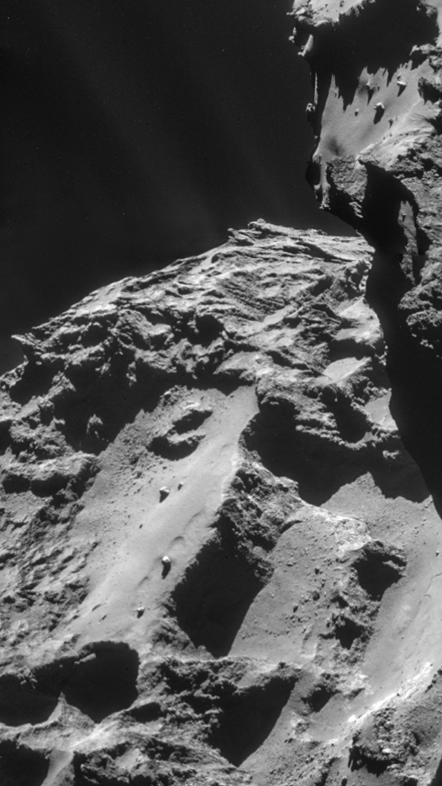
There’s an overhang above the first section of the crack. This is where the crack tracks its way up from the flat, dusty area at the neck base. This overhang is crucial to locating the crack in both photos but it moves, via parallax between the two photos because of the extra foreshortening in the post-perihelion photo. Furthermore, it gets almost whited out (see point 3, below) which renders it almost invisible. The reason it’s crucial for locating the crack is laid out further down. 

Photos 6 and 7 (including unannotated originals for toggling)- the side view showing the overhang and the massif below it. Photo 6 is dated 26th November 2014 and photo 7 is dated 28th March 2015. The purpose of these photos is to show the overhang, massif and crack from two sideways viewpoints but the dates provide additional proof that the crack is not new. 
Copyright: ESA/Rosetta/MPS for OSIRIS Team MPS/UPD/LAM/IAA/SSO/INTA/UPM/DASP/IDA/A.COOPER

Key for both photos:

(If you’ve just scrolled past without toggling and just relying on dots, you’re destined not to see what 67P is trying to tell us. This process is not amenable to an impatient disposition. It requires slowing right down and tapping into a high-attention-span mode).

Yellow- the overhang and the perimeter of the massif below it at the foot of the neck. The two lines are about the same length and parallel, one above the other in these two ‘upright duck’ views. The overhang is annotated orange in the header, as part of a longer orange line. The massif perimeter is also designated orange in other blog parts. This is because they have both been traditionally coloured orange on this blog for the last two years so regular readers will make that link. They’re coloured yellow here simply because yellow shows up better when depicting their parallel nature. 

Red- the crack in question, which is not new. 

The overhang has a wide gap of 30-50 metres below it, to the massif below. However, the squared-off tip of the overhang droops somewhat so as to touch the massif, but the general impression is of an overhang with this parallel, 30- to 50-metre gap along most of its length. 

The yellow profile of the lower massif is the profile you see when looking down on it as viewed in the two figure 1B photos. You can see from the March 28th 2015 version that although the yellow massif line doesn’t quite kiss the dust below it (except at its tip), it is directly above the true cliff base that does kiss the dust. Thus, when viewed from above as we view it in figure 1B this yellow line is, essentially, the line of the cliff base kissing the dust of the Hapi region. 

Note that the massif’s yellow line runs parallel to the overhang’s yellow line when viewed both from above in figure 1B and from the side as in photos 6 and 7. This shows that one line is a pure translation from the other without any rotation introduced, meaning that you could slide the two lines back together through space on a single slide vector and they would merge without having to rotate one at the last minute to fit the other. This fact should be borne in mind as we watch them move in relation to each other, via parallax, between the pre-perihelion and post-perihelion photos in figure 1B. Since their distance vector relationship is a single, pure translation without any rotation element, any amount of relative movement via parallax will nevertheless leave them parallel, as before. Therefore, they can move closer together or further apart or slide past each other in either direction, up-frame or down-frame as we perform the parallax operation. But they will never end up at an angle to each other at the end of the process. Of course, they don’t physically move between the photos. It’s simply an apparent movement in relation to each other brought about via parallax which is, in turn, brought about by a movement of the viewpoint. However, this idea of always staying parallel helps us understand their apparent movement better. We’ll see that out of the options above, they move closer as well as sliding past each other between the two photos, all the while remaining parallel

In the pre-perihelion photo of figure 1B the overhang profile and neck base profile are so satisfyingly parallel that it looks as if the overhang should nest down onto the neck base. Part 25, published two years ago, shows that it once did so, being part of the “orange tell-tale line” linking the orange head match to the orange body match. This is another part which, along with Part 24, analyses Anuket in the most exquisite detail to reveal clear links between four head/body matches. OSIRIS will never see this at the resolution they’re working at. 

When the viewpoint in figure 1B swings over towards the neck in the post-perihelion photo, the two parallel, yellow profiles move closer to each other. Although the two lines don’t actually touch, the cliff and massif they represent appear to merge. The overhang therefore appears to blend with the massif that’s 50 metres below it. This effect is enhanced by the white-out (overexposure). 

Photo 8 (plus unannotated version for toggling)- the overhang and massif move closer together in the post-perihelion photo due to parallax. They appear to merge and thus the whole area appears to be smoothed over. Arrows are original to the paper.
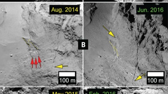
Copyright: ESA/Rosetta/MPS for OSIRIS Team MPS/UPD/LAM/IAA/SSO/INTA/UPM/DASP/IDA/M. R. EL-MAARRY ET AL.(2017)/A.COOPER

The overall effect makes the whole lower part of the neck appear as one smooth rock face in the post-perihelion photo apart from some gentle undulations and the supposed new crack. This sets us up for thinking that we’re looking at an area that’s slightly further up the neck, above both the massif and the overhang (that is, ‘above’ in upright duck mode or to the right in both figure 1B photos). This higher-up area really is a relatively smooth area in the pre-perihelion photo. If a crack really did appear here, post-perihelion, it would genuinely be new. But if it seemed to appear in this area but was actually in the misleadingly smoothed overhang area, it would be mistaken as a new crack when really it’s just the old one that’s now received some favourable shadowing by virtue of the lighting from the left. 

This is what really happened. The supposed new crack is really just the same old pre-perihelion crack sitting in the same place but with its surroundings smoothed over by various chance photographic effects. 

In photo 8, the two yellow lines are placed to within a lateral accuracy of 3-5 metres i.e. in terms of following the correct line. This is judged via being about one yellow dot width or 1/30th of the 100-metre length of the straight section of cliff base nearby. However, the lengths of the two yellow lines are accurate only to about 5-10 metres due to white-out versus shadowing appearing to shorten or lengthen the lines in relation to the differently shadowed photos 6 and 7. This deviation can be quantified somewhat by very careful comparison with small-scale fiduciary features in photos 6 and 7. Although this is possible, it’s beyond the scope of this post because the main point here is that the two lines move closer together. Their exact length is less important.

The apparent disappearance of the overhang should have been questioned by the authors of the paper. As mentioned above, the smoothness of the neck profile in the vicinity of the crack (post-perihelion) might imply that the overhang was lower down, perhaps hidden by a smooth bump further up. This would mean the crack was higher and therefore a new one. But the overhang isn’t hidden and it betrays the crack as being the same feature as the pre-perihelion photo’s crack. Anyone who is familiar with the neck, specifically side-on views will know that you can’t hide the overhang behind anything. This is owing to the concave nature of the neck profile when viewed from the side. 

2- THE POST-PERIHELION PHOTO’S VIEWPOINT IS SLIGHTLY FURTHER NORTH WITH RESPECT TO THE PRE-PERIHELION PHOTO

North is upwards in both frames in figure 1B of the paper. This causes an additional parallax issue in which the overhang appears to slide backwards, down the frame, in relation to its twin, parallel line below which is the massif perimeter. You may have noticed this in photo 8 in addition to the two yellow lines moving closer together.

So the two yellow profiles move closer together as well as sliding past each other, both due to parallax. Again, this sliding-back parallax is compounded by the overexposure in the post-perihelion photo (see point 3). 

3- OVEREXPOSURE IN THE POST-PERIHELION PHOTO            

Even though the post-perihelion photo appears generally darker and the supposed new crack quite dark too, the crucial area around the crack is overexposed, leading to difficulties in ascertaining how the two overhangs have moved closer together and slid past each other via parallax. Furthermore, many other features in the vicinity of the crack are much harder to discern in the post-perihelion photo even though they are indeed there and can be cross-referenced to the pre-perihelion photo. 

It may be hard to discern them but it’s not an impossible task to do so. Sufficient zooming and very thorough analysis makes them discernible and amenable to cross-referencing. The annotated, zoomed-in versions of figure 1B (the header photos) prove that this cross-referencing can be performed so it should have been done in order to check if it might be same crack in both photos. This requires patience, as well as referring to several other photos of the area, taken from different angles and with different lighting. At least one of the 50-plus OSIRIS co-authors might have applied themselves to this task and averted the need for an erratum. It may be a tedious task but it’s simply getting the most out of what’s there in photos that cost us €1.4 billion to put in the data base. 

The reason for the difference in lighting between the two photos in Figure 1B is that the pre-perihelion photo is lit from the top of the frame whereas the post-perihelion photo is lit from the left. This allows the ‘yellow’ overhang and massif to be clear via shadowing in the pre-perihelion photo and almost obliterated, post-perihelion. The sun is shining directly onto them in that photo, greatly reducing any shadowing effects. This gives rise to the apparent smoothness as they appear to merge into one massif going from neck base, all the way to the main crack much further up. 

“BE RIGOROUS”

This was one of the four points that a lead OSIRIS author highlighted as being important in his Rosetta blog post repudiating stretch theory for 67P. I’m being rigorous here (as always) and applying it to an OSIRIS paper that’s lacking in such rigour. 

The authors (and the Science Magazine peer reviewers) should have exercised rigour by questioning where the ragged overhang had gone to in the post-perihelion photo. Many other features further up the neck are also blended together, post-perihelion, so that they’re almost indiscernible too. Extrapolating this phenomenon as being applicable to the yellow overhangs further down should have prompted extreme caution and very careful analysis such as has been done in this blog post. 

The anomaly has been detected and characterised here without even having access to the full-resolution post-perihelion photo: the NAC OSIRIS photos from June 2015 onwards are still under embargo as of the date of this post. The cross-referencing between pre- and post-perihelion photos would have been much easier for the authors and peer reviewers to do with that full-res photo. 

I’ve been told by one OSIRIS lead author that I can’t make accurate quantitative judgements about the comet’s features without looking at the highest resolution NAC photos, which until recently weren’t routinely available to me and Marco at the times of publishing our blog posts. However, that argument only applies to seeing new, more detailed features in the photos. What is already discernible in the lower res photos can’t be ‘unseen’ by looking at the hi-res photos. This is borne out by the fact that the OSIRIS NAC photos are now available up to May 2015, we’ve gone through them, and they enhance rather than detract from the claims we make. Those claims are the specific conclusions regarding the manifold aspects of stretch theory that we’ve made in the 100-plus blog posts we’ve so far published between us. 

The Rosetta blog lead author also said:

“Any promising observation deserves a thorough and detailed investigation to understand the possible errors.”

I agree. This is why all the stretch blog parts are as rigorous as this one with multiple lines of investigation, careful description and many photos from different viewpoints. I’m simply applying the same high standards here as I do to each and every one of my blog posts. But in this case I’m applying it to an OSIRIS paper which hasn’t done such a “thorough and detailed investigation to understand the possible errors.”

Jpeg anomalies have also been cited as being a confounding issue regarding doing a quantitative analysis. I’m aware of this. There are some jpeg anomalies in the post-perihelion photo that were avoided. 

LOCATING THE CRACK USING THE SQUARED-OFF TIP OF THE OVERHANG. 

Photos 9 and 10- the 26th November 2014 and 28th March 2015 photos with originals inline for toggling between annotated and unannotated.
Copyright: ESA/Rosetta/MPS for OSIRIS Team MPS/UPD/LAM/IAA/SSO/INTA/UPM/DASP/IDA/A.COOPER

The ‘yellow’ overhang is crucial because the crack traces a line that is contiguous with its squared-off tip. The tip is therefore an important fiduciary point in both photos. Either side (north and south) of the squared-off tip, the crack departs from the overhang profile so it’s really just skimming past (while skirting round) the squared-off section. It may actually just run under the squared-off tip but since that’s out of sight, the crack is annotated here as going round it. 

North of the squared-off tip, the crack runs down one side of a flatter, rectangular area (with two annotated pink dots at one end in the headers plus orange round the back and a bright green, thinner, northern extension). This rectangle is ‘horizontal’ with respect to the ‘vertical’ alcove (yellow) that it passes under. After that, the crack runs along the northern bottom section of the alcove profile, rounds a bend, and continues in a straight line to its end point. The end is where the crack just starts to curve into a small bay with a boulder in it. The bay is annotated brown and the boulder is light blue. 

Incidentally, two possible tracks have been annotated for the crack’s track for the short distance between the rectangle and bend. They appear as two alternative red-dotted tracks in different photos in this post. One is an actual crack, the other, another overhang with a bulbous profile. One is above the other (in upright duck mode) so we can’t tell from the top-down, post-perihelion viewpoint in figure 1B, which it is. But I suspect it’s the overhang.

South of the squared-off tip (towards frame bottom in the header; to the right in the photo above) the crack tracks down the sloping massif to a small cove in the cliff base (slate blue). The massif itself slopes up from the cove by enough to reach the overhang’s squared-off tip at its northern end. The squared-off tip also droops a bit to make up the gap and achieve the physical connection. 

Thus, the squared-off tip of the overhang is an important fiduciary point for locating the crack in both of the figure 1B photos. It is indeed present in both photos. From there, the same crack can be traced in both photos using additional fiduciary points (slate blue cove, rectangle etc as annotated in the photos above). Since it’s the same crack, it’s not new. And just to make it absolutely clear, here is a reminder of the pre-perihelion photo dated 26th November 2014 showing the same crack. 

Photo 6 (reproduced)- the pre-perihelion, 26th November 2014 side view of the crack, showing that it couldn’t have appeared over perihelion 2015 and therefore isn’t new. 
Copyright: ESA/Rosetta/MPS for OSIRIS Team MPS/UPD/LAM/IAA/SSO/INTA/UPM/DASP/IDA/A.COOPER

THE MAIN CRACK BECOMES MORE PARALLEL TO THE SUPPOSED NEW CRACK

Despite the abundance of evidence above, one might be forgiven for wondering how it is that there’s an angle between the supposed new crack and the main crack in the pre-perihelion photo and yet they become parallel in the post-perihelion photo. This is simply one of the vicissitudes of changing perspective by swinging closer to the neck and drifting north. 

The important thing to remember here is that the cliff base that kisses the Hapi dust also swings round so as to become parallel to the main crack. The cliff base is essentially parallel to the supposed new crack and the two together swing round to become parallel with the main crack, post-perihelion, after having been at an angle to it pre-perihelion. Therefore, if one argues that the crack can’t swing round that far between the two photos and that it must therefore be a new crack, they also have to explain how the cliff rim can clearly swing round by this degree whilst the crack is not permitted to do so. 

The fiduciary points in the header show the pre-perihelion and post-perihelion cracks to be the same anyway. This therefore shows that the swing-round to make the main crack more parallel is a perspective issue. This subsection is somewhat redundant but it’s included for completeness in case anyone is scratching their head over the parallel nature of the cracks in the post-perihelion photo. I have several annotated photos to illustrate the point if anyone wishes me to insert them below here. 

THE SUPPOSED MAIN-CRACK EXTENSION

A further extension of the main crack, which is above the supposed new crack, was also cited in figure 1B. We’ve established above that the supposed new crack isn’t new. Other supposed changes on the neck as presented in the paper look dubious to me as well, such as this extension of the main crack. Some of the extra extent is visible in pre-perihelion photos though perhaps not the whole extent. Are the authors scanning this area in all available pre-perihelion photos like Marco does or just looking at this one photo that whites out some of the crack extent pre-perihelion? I fear it’s the latter:

Photo 11- 16th December 2014. 
Copyright: ESA/Rosetta/MPS for OSIRIS Team MPS/UPD/LAM/IAA/SSO/INTA/UPM/DASP/IDA/A.COOPER

The red arrow in photo 10 is pointing at precisely the same point as the yellow arrow is pointing to in the pre-perihelion photo in figure 1B of the paper. The yellow arrow is pointing to the supposed lack of a crack extension while the red arrow is pointing to just such an ‘extension’ except it was always there. The reason it’s not apparent in the figure 1B pre-perihelion photo is that a) that photo is somewhat whited out and b) we’re looking down the neck and the ever-present crack is hidden by a small lump. 

As I say, there probably is some main-crack evolution in this area but the figure 1B photos don’t support it. Marco had already found a noticeable subsidence episode within the main crack and only metres from the supposed extension area. This would suggest that what had always been visible as a crack extension a bit further along has widened slightly but not recently opened up from nothing. 

I didn’t have to trawl the photos to find the crack section marked by the red arrow. I simply know the neck well enough to know this obvious section of the crack was there in 2014. I was constantly drawn to it for two-and-a-half years as the potential smoking gun for spidery crack lines either side of it (which were indeed there, pre-perihelion as well but are beyond the scope of this post). OSIRIS didn’t know about this. They didn’t double-check their figure 1B assertion using photos from all angles and earlier dates and for this reason their approach is severely wanting. 

WHY IS THIS IMPORTANT?

If there are no changes on the neck, there will be no supporting evidence for papers such a Hirabayashi et al. 2016 who postulated the tearing apart of the lobes at sub 6.5-hr rotation rates (calculated as sub 5.8 hrs on this blog in 2015- see ‘Spin-Up Calcs’ in the menu bar). If there are spurious changes cited such as a new crack opening up (right on the equator, no less) then spurious support is given to the Hirabayashi paper and all the stretch evidence published on this and Marco’s blog for a year before that. 

Even as you read this there will be more papers being prepared which will be looking for such evidence as new cracks or extended cracks. They will need this evidence to support their case for tensile strain due to 67P’s spin-up. This will be in pursuit of a logical evolution from the premises laid out in Hirabayashi et al. (2016) and Movshivitz et al. (2017). Those two papers are slowly inching their way towards the inevitable conclusion that a single body stretched into an ellipsoid then sheared into two separate lobes, essentially describing the title of this blog. 

The tensile strain would be actual movement of boulders/surface features and cracks opening, all of them along the equator line vector. Also, papers dwelling on any manner of crack-related phenomena such as outbursts would find such supposed evidence of a new crack useful to cite. Their citations of what is a spurious new crack in M. R. El-Maarry et al. (2017) will compound the problem and subsequent citations of those papers will spread it further like a virus. Cometary science will suffer as a result.

But of course, there really are substantial changes on the neck and they have been quantified in a detailed and professional manner by Marco Parigi. Those four changes- two moving boulders, one cliff collapse and a mid-crack subsidence episode- are the changes that support Hirabayashi et al. (2016) and stretch theory. All four support the idea of a variation in tensile stress acting along the equator line vector as one would expect with the increased rotation rate which occurred in 2015. They provide the tensile strain evidence which should be attracting attention from the OSIRIS team. As long as OSIRIS approach the photo analysis in the manner they have thus far, they’ll miss them.

Moving boulder:

https://www.google.it/amp/s/scute1133site.wordpress.com/2016/08/18/part-55-marco-parigis-moving-boulder-close-analysis-proves-hes-right/amp/

Second moving boulder:

http://marcoparigi.blogspot.co.uk/2016/06/lateral-movement-of-surface-in-anuket.html?m=0

Cliff collapse (including planetary.org article):

http://www.planetary.org/blogs/guest-blogs/2017/20170227-citizen-scientists-spot-rosetta-comet-changes.html

http://marcoparigi.blogspot.co.uk/2016/06/more-on-rockfall-area.html?m=0

http://marcoparigi.blogspot.co.uk/2016/06/rockfall-in-anuket-sah-region.html?m=0

http://marcoparigi.blogspot.co.uk/2016/10/timing-for-anuket-sah-collapse-not.html?m=0

Crack subsidence (including a photo presumably annotated by M. R. El-Marry et al. (2017) which overlooks this impressive change in favour of much less impressive changes to the left):

http://marcoparigi.blogspot.co.uk/search/label/Stretch?m=0

Photo 12- Photo released on the same day as M. R. El-Maarry et al. 2017 so it was presumably annotated by them and used by them for research, although it’s not in the paper. It shows Marco’s obvious crack subsidence event (added red arrow).
Copyright: ESA/Rosetta/MPS for OSIRIS Team MPS/UPD/LAM/IAA/SSO/INTA/UPM/DASP/IDA/M. R. El-Maarry et al. (2017)/ A.COOPER

Photo 12, bottom panel, shows the supposed new crack along with a suggested extension (arrows). The above arguments for the crack apply to the extension too as there’s a faint line here, pre-perihelion, too.  

A WORD ABOUT STRETCH THEORY

Stretch theory is now so far advanced that all the evidence for this post was researched and blogged two years ago. I’m looking at these OSIRIS papers as they come out, immediately seeing problems based on a deep prior knowledge of the areas involved and digging out old data to prove my case. I’m not trawling through NAC photos in a reactionary operation to see if I can find fault. True, the NAC photos weren’t available two years ago, only NAVCAM photos were, but the NAC photos were sought out based on that prior knowledge of the area. 

The NAC photos used in this post fully corroborate the claims in what are now very old posts. This is the 50th post since that time, every one of them tweeted to @ESA_Rosetta, @RosettaOSIRIS or #67P. This, as well as linking many blog parts on the Rosetta blog comments or emailing the link direct to OSIRIS lead authors. 

The early claims have now been built on to the point where we have vastly more knowledge of this particular area around the crack than what is laid out above. We know why the crack is there and why the yellow-dotted alcove above it is there. We’ve worked out why the ‘orange’ line is less well-defined than the green, yellow and mauve lines in Part 25. We know why all four lines have a kink at the same point, halfway up the neck and why yellow and mauve merge below that point. We know the reason for the small coves along the neck base and the patterns in the Hapi dust beyond them. We understand why the overhang and massif are parallel. We know how this relates to the ripples nearby, the spidery outcrop in Hapi nearby and the strange curves leading from it. We know why there’s a straighter line dividing the curves from the ripples, why there’s a Y-shape in the middle of that line and why it ends precisely at the massif tip. We’ve found the reason for the existence and shapes of polygon fields in the Hapi dust. We understand what the lines going up the neck are and where they’ve come from, what the big zig-zag lump is off to the right, where it used to sit and why it would likely be the site of a cliff collapse (which it was). We know how the zig-zag lump relates to the supposed scarps in Sobek further round the neck. We know why the ‘slate blue’ cove sits along an uncannily straight line when viewed from further away. We know why icy blocks are sticking out of Anuket just round the corner from here and why there’s a large protrusion in the Anuket neck high up but directly above the crack. We understand these twenty-four things and much more, based on observation of the morphology at the 5- to 10-metre scale. They are all interdependent, and satisfy only one internally consistent narrative: stretch. The crack, which was there when Rosetta arrived, is just one very small and familiar piece of this jigsaw. 

All this work over the last two years leads to the conclusion that this comet is so much more surprising and interesting than we could ever have dared or hoped to imagine. 

CONCLUSION

The supposed new crack in M. R. El-Maarry et al. (2017) has been shown to have existed long before perihelion 2015. It’s therefore not new, as claimed in that paper. 

OSIRIS simply don’t scrutinise 67P at the same level of detail and resolution as this blog or Marco Parigi’s blog do. Is it any wonder they don’t see the evidence for 67P stretching? Evidence which we have found all over the comet and have been communicating to them, incessantly and via every imaginable medium, for the last two-and-a-half years.
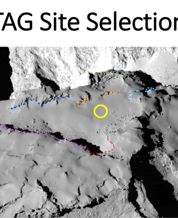
Part 75- The Long-Axis Bes Delaminations


ESA/Rosetta/MPS for OSIRIS Team MPS/UPD/LAM/IAA/SSO/INTA/UPM/DASP/IDA/A.COOPER

Please zoom the header to see the Bes delaminations. 

Photo 2- view looking down on the base. 


ESA/Rosetta/MPS for OSIRIS Team MPS/UPD/LAM/IAA/SSO/INTA/UPM/DASP/IDA/A.COOPER

Red arrows in photo 2 show symmetrical delamination vectors on all four sides of the body lobe diamond. 

Photo 3- ESA regional map showing Bes, a lesser known region in the southern hemisphere of the comet. 
ESA/Rosetta/MPS for OSIRIS Team MPS/UPD/LAM/IAA/SSO/INTA/UPM/DASP/IDA/A.COOPER
Bes adjoins Imhotep so it could be argued that it’s part of the comet base but a somewhat curving-away part in comparison with the flatter Imhotep area itself. Bes was often visible in the early NAVCAM photos of Imhotep in 2014. However, it was poorly lit due to being in the southern hemisphere during its winter. 
INTRODUCTION 
More detailed photos of the Bes delaminations follow this introduction which includes an overview of the delaminations on all four sides of the body lobe diamond. This description therefore puts the Bes delaminations in perspective as a predictable part of a larger, unfolding stretch scenario. 
The Bes delaminations separated along the expected tensile force vectors set up in a comet that has spun up to a 2- to 3-hour rotation period- just like with the other four diamond sides. This is as opposed to presenting the Bes delaminations as interesting, isolated, random scarps that happen to be parallel for no discernible reason and arranged along a vector that’s in any old direction. They’re arranged, in fact absolutely straitjacketed, in one direction: the long-axis stretch direction. 
The header photos show an overview of the delamination vectors down the four sides of the diamond-shaped base of the body lobe. The vectors are in two pairs, each pair running from one of the two short-axis tips. All four vectors stop at either one of the two flattened-off long-axis tips of the body. So they all run from short-axis tip to long axis tip, are all almost equal in length and are all relatively straight. This is indeed why the body is a stunningly symmetrical diamond shape.
The four sides of the diamond were brought about by the tensile forces of stretch running down the long axis of the body and the two flattened long-axis tips ‘pulling’ at both ends. This led to the four distinctive morphologies along each side of the diamond and these were noticed by the ESA scientists as being different. This is why those four morphologies were delineated as different regions. 
The result is that we have a situation where, on a supposedly randomly aggregated, and randomly eroding cometesimal we have four regions that just so happen to be of equal length and entirely bounded by a long axis tip and a short axis tip in all four cases (each defining one side of the body diamond). Those regions are Bes, Khonsu, Ash and Aten. 
The Khonsu delaminations have been presented already (please see the page in the menu bar). The Khonsu delaminations have also been tweeted (with annotated photos) to several ESA scientists including an OSIRIS author.
The Bes delaminations were brought forward in the blog post queue because they’re needed in order to explain the complex behaviour of the ‘first green slide’ at Imhotep. That’s one of the three green slides that were presented in Part 42 but little explanation was given for how it slid. Part 42 was only an overview of all the Imhotep slides. It showed eight slides in four colour categories. The full explanation for the first green slide will come soon and will be much easier to comprehend once the detailed photos of the Bes delaminations are understood. This is because the Bes delamination vector tugged on the first green slide too. It will be actually be called ‘the first green slide’, for want of a better term because there are two other Imhotep slides designated as green by virtue of their similar sliding behaviour. Also the one designated as first is also the most important of the three. 
The Aten and Ash delaminations remain to be presented. They behaved much the same as Bes and Khonsu through being crust forced to delaminate in order to accomodate the long-axis stretching of the comet’s core. This essentially involved stealing internal cometary matrix from the short axis and donating it to the long axis. As a result, the short axis reduced even more in length while the long axis increased even more in length. The short axis reduction was subsequently reversed somewhat by radial sliding of crust after the head sheared from the body. This is why, for example, the border between Bes and Anhur is long, straight and sharp, like a knife edge. The Cliffs of Aten are radially slid material as well and their remarkably straight edge constitutes most of the Aten diamond side. 
So although the delaminations on the four sides of the body produced the diamond, they may well have produced an ellipsoid had it not been for the further fashioning as a result of radial crust sliding. The radial crust sliding is a separate phenomenon from the core-directed long-axis delaminations even though those delaminating layers were surely sliding, in a more regimented fashion, over each other towards the long-axis tip. Radial slides were simply newly loosened pieces of crust trying to slide to a position that’s further away from the rotation axis while under the influence of the centrifugal force of spin-up. They couldn’t slide radially until loosened. Before loosening, they could only delaminate along the long-axis vector (or rather, the closest local-surface vector to the long-axis vector). And they delaminated only if called upon to do so by the exigencies of the surface crust having to accommodate the long-axis core stretch. Conversely, loosened-crust sliding respects only the rotation axis and therefore slides over the body in the direction which is the shortest distance to get away from the rotation axis. 
Whilst, the moment of head shear was responsible for the Babi and Aswan radial slides, it can’t explain the obvious radial sliding at Imhotep (e.g. blue slides in Part 42 and in fact Bes too but only *after* Bes delaminated on the long axis vector). It seems that there came a point where the Imhotep long-axis delaminations loosened the crust enough to slide radially anyway. 
MORE BES PHOTOS INCLUDING MINI DELAMINATIONS

ESA/Rosetta/MPS for OSIRIS Team MPS/UPD/LAM/IAA/SSO/INTA/UPM/DASP/IDA/A.COOPER

Photo 4- A simple long-distance representation of the three most obvious delaminations (plus original).

Strictly speaking, there are only two delaminations in photo 4, the second and third lines on the right. The first line is their original seating. But they’re just called the Bes delaminations here for expediency. There are several less obvious delaminations added to the right of these three in later photos. 

Photo 5- same as phot 4 but also showing a red slide track. 
The red slide track in photo 5 is almost dead straight and links the tops of all three delaminations. 

Photo 6- a close up of the first and second delaminations with mini-delaminations shown as well. 
Please refer to the unannotated version to see for yourself as the annotations partially obscure the very detail they’re depicting. 
Many of the mini delaminations in photo 6 actually trace the shape of the upside-down L-shape at the top of the three delaminations. The joined-up ends of the L’s together trace the horizontal (in this view) slide track annotated red in photo 5. The other line of L’s, halfway down, trace the track of another upside-down L-shape that’s also halfway down the second delamination. 
These mini-delaminations are uncannily similar to delaminations at Aker. In Part 51, it was shown that a long, angular feature (annotated mauve in that part) had delaminated either side of the rotation plane at Aker. So it delaminated, north and south because the tensile forces of stretch turn north-south as they round the flattened long-axis tips. Between the main Aker delaminations we see mini-delaminations that are virtually identical to the ones we see here at Bes. The Aker ones are in fact neater and more obvious. However, the Part 51 photos don’t do them justice even though they are visible. I may try and find a suitable OSIRIS close-up of them and add it here in due course. 
Photo 7- same as photo 6 but with the southern perimeter of the first green slide shown. Also, two yellow triangles and their slide track. 
Notice how in photo 7, the first green slide perimeter is contiguous with the first Bes delamination. This is why the Bes delaminations affect the first green slide. The northern first green slide perimeter is just out of sight behind a ridge due to the low profile view. However, the first green slide is one of the the 17 paleo rotation plane signatures and has been presented as such on the Paleo Rotation Plane Adjustment page. It’s called the green triangle on that page. It’s an isosceles triangle, straddling the paleo rotation plane/equator and has the all-important ‘finger’ at its height vertex. The green slide was also presented in Part 42, as mentioned above, but that rendition is somewhat inaccurate, or rather, what’s shown is accurate but it doesn’t show the full perimeter of the layer that slid. In other words, it doesn’t include the full green triangle that constitutes both the first green slide and the paleo plane signature as one and the same triangular chunk of crust. This correction is simply due to studying the comet for a further 9 months since Part 42. 
Photo 8- The header overview reproduced with its  original.
Photo 9- long-distance view including the head lobe. The delaminations aren’t as accurately shown here as in above closer views because of overexposure of the actual features. The first green slide triangle adjoins the first Bes delamination. You may be able to make it out.
PHOTO CREDITS

FOR NAVCAM:
Copyright ESA/Rosetta/NAVCAM – CC BY-SA IGO 3.0
To view a copy of this licence please visit:
http://creativecommons.org/licenses/by-sa/3.0/igo/
All dotted annotations by A. Cooper. 
FOR OSIRIS:
Copyright: ESA/Rosetta/MPS for OSIRIS Team MPS/UPD/LAM/IAA/SSO/INTA/UPM/DASP/IDA/A.COOPER

Part 74- Temporal Morphological Changes in the Hapi/Ripples Region of 67P/Churyumov-Gerasimenko Cast Doubt on Aeolian Dune Theory

The photo below is the original for the above. This is a control photo used to show the area before the near-perihelion changes took place. It’s from Thomas et al. 2015 and was taken well before perihelion. The annotations therefore show future changes in this area.

Copyright: ESA/Rosetta/MPS for OSIRIS Team MPS/UPD/LAM/IAA/SSO/INTA/UPM/DASP/IDA/A.COOPER 
All photos below have this credit as well.

The header photos show  one particular stage in the progress of the morphological changes in the Hapi region that occurred between 15th April 2015 and 27th February 2016. 
The morphological changes proceeded in a manner that was in keeping with the changes that commenced at Imhotep some six weeks later and lasted for at least six more weeks. The Imhotep changes were documented in Groussin et al. 2015. 
The changes continued before and after the April 25th photo above. Below is a longer, 21-photo chronology. More commentary will be posted later. 

The January 17th 2016 photo was used in Jia et al. 2017. That paper argued that the vestigial scarp-like features are dunes. The largest supposed dune is in fact the final resting place of the large scarp in the April 25th photo above. It is not a dune. 
The dune theory will now have to argue that two successive pits of ~5m depth appearing in the middle of the ripples and eroding across them can be reconciled with gentle transverse winds propagating the supposed dunes ten metres in the opposite direction to the erosion and at the same time. 

THE 21-PHOTO CHRONOLOGY

Photos have annotations as follows:

Red- fiduciary points. They’re the two ends of the cliff that the ripples kiss. They’re almost exactly 100m apart. 

Light blue- fiduciary points. These are four recognisable boulders that  enclose the area of most interest. But look for major subsidence of the same nature in the adjoining area too. That area is always shown. Its very obvious dips appear and grow just like in the ripples area. This suggests subsidence/erosion is the driving mechanism over this entire area, not aeolian dune migration. 
Text annotations:

The date of the photo.

‘+[a number]’: days since last photo in the sequence. This helps understand the changes/rate of propagation.

MTP number/Photo number.

28th March shows first definitive changes. There were possible smaller changes from March 15th (not included here).


PHOTO CREDITS
FOR OSIRIS:
Copyright: ESA/Rosetta/MPS for OSIRIS Team MPS/UPD/LAM/IAA/SSO/INTA/UPM/DASP/IDA/A.COOPER

Part 73A- Erosion in The Anubis Region on Comet 67P/Churyumov-Gerasimenko During Perihelion 2015. 


Copyright ESA/Rosetta/NAVCAM – CC BY-SA IGO 3.0/A.COOPER

The gif above is composed of the two stills below it. The first still was taken by the Rosetta orbiter navigation camera (NAVCAM) several months before the perihelion of comet 67P in August 2015. The black area on this photo is due to swivelling the frame to align it for the gif. This was coloured grey in the gif to reduce distraction. 

The second still was taken several months after perihelion. You can see that the flat-bottomed depression has grown over the course of perihelion. 

The third photo is an image taken by the NAVCAM on arrival at 67P in August 2014. It’s presented here as a context image with an arrow pointing at the lip of the depression. This would be the bottom lip with respect to the orientation of the gif stills. You can just about see that it’s the pre-perihelion shape.

The two gif stills have been rotated and sized so that the two large boulders at upper-left and lower right are perfectly aligned. This introduces small inbuilt errors into the gif due to the slight parallax between the images. It’s as if the gif is trying to force them into alignment. These errors are small compared to the dimensions of the newly eroded area. However, they’re discussed in the appendix for completeness. 

THE ANUBIS DEPRESSION

The Anubis region is defined by the fact it’s composed almost entirely of smooth, dusty terrain. Anubis already had a small depression when Rosetta arrived at the comet in August 2014. It was roughly speaking a square, about 300m x 300m, with rounded corners (see the first still used for the gif). It incorporated three finger-like features at one end, within its depressed boundary line. It was flat-bottomed and exhibited a circa five-metre-deep scarp all the way round, defining the boundary. 

This depression grew noticeably during the perihelion of 2015. The growth is easy to make out when toggling between ‘before’ and ‘after’ photos and even clearer in the gif. This change on 67P hasn’t been documented yet in any scientific papers. 

The main area of new erosion is the stubby ‘thumb’ on the right that’s now been added to the three fingers. It now looks like a dinosaur footprint. The thumb has grown far enough to incorporate the lower-right boulder into the depression. The fingers have also grown in length and become more defined. The left finger has grown enough to kiss the upper-left boulder. 

Although the growth of the depression is obvious, the two boulders act as fiduciary points in both photos to prove the growth definitively: if they were outside the depression before perihelion and are now at least touching the edge after perihelion, the perimeter must have grown. 

The perimeter of the thumb and extended fingers has the same characteristic scarp as the rest of the depression. The scarp is also uncannily similar to the depressions that appeared in the Imhotep region during June and July 2015, just before perihelion. These are discussed in the next sub-heading. The similarity suggests that the erosion mechanism that brought about the Imhotep depressions is also responsible for the growth of the fingers and thumb at Anubis. 

It’s difficult to find photos showing the progress of the erosion because Rosetta was far from the comet at perihelion in order to avoid the greater flux of dust at that time. 

THE GROUSSIN ET AL. (2015) PRECEDENT

This short summary of the discoveries made in Groussin et al. (2015) allows the Anubis discovery to be put into some sort of context. The similar depressions they found at Imhotep serve as a precedent for the study of the Anubis depression. 

In early June 2015, as 67P was approaching perihelion, a large area of the smooth terrain in the Imhotep region began to erode in dramatic fashion. The whole event was captured by the OSIRIS Narrow Angle Camera (NAC) on the Rosetta orbiter. Five distinct depressions grew at a surprisingly fast rate. Each area was quasi-circular, flat-bottomed and exhibited an eroding scarp some five metres in depth. The circles grew as their circumferential scarps eroded their way across the smooth terrain. By mid-July, all five depressions had merged into one depression covering 40% of the smooth terrain, about 0.32 square kilometres. 

The photo below is of the first two quasi-circular depressions to appear at Imhotep. They’re shown as they were on 27th June 2015, arrowed red and yellow (NAC photo).
A detail from Groussin et al. (2015) Fig. 1

A&A 583, A36 (2015)
DOI: 10.1051/0004-6361/201527020 ⃝c ESO 2015 

Copyright: ESA/Rosetta/MPS for OSIRIS Team MPS/UPD/LAM/IAA/SSO/INTA/UPM/DASP/IDA/

The two depressions in the photo above are known as A and B in Groussin et al. (2015). They were already growing fast at this point with the other three about to start.

The data collected by the OSIRIS team was presented soon afterwards in Groussin et al. (2015). It wasn’t just photos, the various colour filters on the NAC enabled the detection of a probable ice signature in each depression. This suggests that sublimation of ice was responsible for the erosion, either H20 ice or CO2 ice or some mixture of the two. However, the extent to which ice loss contributed to the overall erosion is currently a subject of debate because Groussin et al. (2015) found that the volume of erosion was orders of magnitude greater than their ice sublimation models would suggest as being possible. Furthermore, very little dust was seen to be escaping from above the area in question at that time. The paper is here (not paywalled):

http://www.aanda.org/articles/aa/abs/2015/11/aa27020-15/aa27020-15.html

TWO ADDITIONAL DEPRESSIONS

Although the Groussin et al. erosion event was by far the most obvious one during the few months around perihelion, there were at least two other small areas that exhibited the same apparent behaviour, that is, a scarp of some five metres in depth eroding its way across and through a section of smooth terrain. One area is the Anubis depression discussed above. The other one is a new depression measuring about 200m x 200m. It’s located in a small basin next to the much larger Imhotep depression described above. This area is somewhat harder to make out and is beyond the scope of this post. 

APPENDIX- ERROR BARS FOR THE GIF

The ‘before’ and ‘after’ photos used for the gif appear to have been taken from a similar angle but they’re some 10° to 20° apart as measured from the centre of gravity of the comet. This translates to a 10° to 20° difference in the angle of incidence of the viewpoint line at the Anubis depression’s surface. By locking the gif components to the two large boulders at upper-left and lower-right we automatically stretch the more foreshortened one by up to 1.5% (for 10°) and 6.5% (for 20°). 

It can’t be the full 6.5% because the angle between the two viewing points isn’t subtended within a plane that could be coplanar with any plane projected by the line between the boulders. In other words, part of the angle difference, or drift, between the two views is across the boulder line and not in line with it. This is evident in the fact that there’s a clockwise/anti-clockwise wiggle between the two gif images. So the anomaly is shared between the component of the angle difference along the boulder line and the component across the boulder line. It’s probably something like 3% along the boulder line meaning that one image has been stretched by 3% so as to align the boulders. Whichever way, this small anomaly is swamped by the size of the newly eroded area. 
Andrew Cooper is a citizen scientist with an interest in NEO’s and comets, especially their orbital dynamics and spin behaviour. He has worked with Marco Parigi since August 2014, analysing the morphology of 67P. 

PHOTO CREDITS

FOR NAVCAM:

Copyright ESA/Rosetta/NAVCAM – CC BY-SA IGO 3.0

To view a copy of this licence please visit:

http://creativecommons.org/licenses/by-sa/3.0/igo/

All dotted annotations by A. Cooper. 

FOR OSIRIS NAC – Groussin et al. (2015) detail.

Copyright: ESA/Rosetta/MPS for OSIRIS Team MPS/UPD/LAM/IAA/SSO/INTA/UPM/DASP/IDA/

Part 73- The 4.5-Kilometre-Long Rift From The Northern Long-Axis Tensile Force Line

Original:

Copyright ESA/Rosetta/NAVCAM – CC BY-SA IGO 3.0/A.COOPER

The headers are reproduced below with their keys and explanations. The ESA regions map is at the end of this post for those who are unfamiliar with the region names and locations. 

INTRODUCTION

In Part 72, we saw how dominant the northern and southern long-axis tensile force vectors were. This part continues that theme but dwells on the fact that the northern tensile force line gave rise to a rift running the whole length of the body lobe. It should be regarded as the entire area of Seth, Babi and Ash, below the bottom red line, shunting away en masse from the northern, long-axis tensile force line. It involves at least two onion layer thickness. 

THE PHOTOS

Photo 1- the long-axis tensile force lines. This is reproduced from Part 72.

Red- the northern and southern long-axis tensile force lines. The northern one is the nearer one. They run from long-axis tip to long-axis tip on the body. They passed either side of the proto-head lobe before it sheared from the body. They now pass either side of the neck which is itself elongated along the long axis for the very reason that these two force vectors were stretching it along that vector. 

Bright green- the Apis region at the long-axis tip. The two tensile force lines join just above Apis and in line with its centre, the exact long-axis tip. 

Photo 2- the lower onion layers that rifted from the northern long-axis tensile force line. In Hapi, it’s the third layer down from the paleo surface. The paleo surface is the original surface of the single body-  see Part 41, scroll to ‘the three levels’. This third layer down appears as the second layer down today because the old top layer slid to the back of Aswan (the terraced cliff) and Babi (the Cliffs of Aten). The two lines angled away, either side of Hapi, are today’s top layer rifted from the same northern tensile force line. This corresponds to the second paleo layer down except near Apis where it’s also the top paleo layer (see the Ash recoil, below). This completes the rift running the whole length of the body lobe.  

This is essentially a rift that runs from one end of the body lobe to the other. It runs between the two long-axis tips because the tensile force line it rifted from also runs between the two long-axis tips. It should be visualised as being the entire section of surface crust incorporating Seth, Ash and Babi doing a one-off shunt away from the tensile force line. The shunt was between 150 metres (at Aker/Babi) and 400 metres (central Hapi). It incorporates the 1.6km x 200m rift (Parts 48 and 49) running through Seth and Ash. It involves at least two layers. The upper layer slid even further on as described in Parts 32, 33, 40.

The wider, Hapi section of the rift corresponds to the shunt of the Hapi cliff line from the line of boulders along Hapi. This was presented in Part 47. It could be possible that, to some extent, it was the boulder line that rifted away from the Hapi cliff line when the head lobe sheared and drew neck material up with it and out of Hapi. The boulder line would in that case have been drawn across Hapi in a translational movement from the cliff whilst maintaining the shape of the cliff line along its length. Part 47 shows how that translational match across 350 to 400 metres is still discernible today. This sweeping up of neck material and dragging the boulder line back from the cliff in the process would explain the rift being wider at this point. This was touched on in the previous part. The principle of the head lobe drawing up neck material with it as it rose on the incipient neck after shearing is dealt with in Part 25. 

What is new in this part, regarding this much longer rift, is that the two rifts from Parts 48/9 and Part 47 have been linked as being one long rift. This was achievable because the line from which they rifted, the northern tensile force line, was identified as continuing along the Hapi boulder line from the southern perimeter of the 1.6km x 200m rift (Part 72). And in order to join those two lines, the southern perimeter of the 1.6km x 200m rift had to be identified as extending further, past the mauve anchor and into Hapi. That identification was done via the four mauve features that delaminated along the northern tensile force line, thereby betraying its existence in Hapi. That proved that the northern tensile force line continues from the mauve anchor, right up to the beginning of the boulder line. This discovery was presented in Part 71 and so it links the southern perimeter of the 1.6km x 200m rift to the Hapi boulder line. This means the rift runs from Apis to at least the other end of Hapi. 

The final piece in the puzzle is that the Babi slide (Part 40) incorporates a 150-metre-wide rift along the border of Aker and Khepry. Since this rift runs from the end of the boulder line in Hapi to the other long-axis tip, it completes the rift running the entire length of the body lobe, as depicted above. This rift hasn’t been blogged yet but it was responsible for getting the slide track of the fourth Babi cuboid wrong in the original Part 40 post. It was the discovery of the cuboid’s true track (and matched seating at the end of Hapi) that betrayed the rift. See the update at the end of Part 40 showing this seating match and slide track in detail on an OSIRIS image. The 150m rift is implied by the new track but wasn’t explicitly pointed out. So the rift now runs the entire length of the body lobe from long-axis tip to long-axis tip as shown in the photos above and photo 3 below. 

Photo 3- the v’s show the direction of the rifting crust away from the northern long-axis tensile force line. The v’s are therefore slide vectors. 

Photo 4- this shows how there were two overall stretching and sliding vectors at play: (1) long-axis, core-directed stretch (running between and parallel to the two tensile force lines) and (2) radial sliding of crust (outside the tensile force lines). 

Although the long axis stretch and radial slide vectors appear somewhat schematic in photo 4, they are real slide vectors that have been identified via translational matches and were blogged long ago. See photos 7 to 11 which build on the above slides with several more arrow vectors. Photo 11 shows the various part numbers for each slide. 

The reason photo 4 has fewer arrows is because the intention is to make it appear schematic so as to emphasise the obviously different direction of the long arrow between the tensile force lines. That arrow is running along the long axis i.e. parallel to the tensile force lines while all the others are directed away from it in a radial pattern. Clearly, there were two different mechanisms at play either side of the northern tensile force line. We saw this very much in close-up in Part 71 with the mauve delaminations sliding along the length of the tensile force line, kissing one side of the line as they slid along it. Meanwhile, the Aswan slide rifted away from the other side of the line at 90°. The northern tensile force line is a very strong demarcation line between these two different slide vectors. This was also shown as far back as Part 50 with a really crisp depiction of the orthogonal nature of the slide vectors in the vicinity of the ‘blocky rectangle’, which is the #4 mauve delamination. That was a detailed OSIRIS photo.

Photo 5- this shows the continuation of the long-axis stretch vector going under the neck and along its centreline.

In photo 5, the head lobe is in the way of the neck so we’re looking through the head, and the neck as well, to the arrow running along the base of the neck. It has points at both ends, depicting the fact that the neck was stretching both ways, causing it to elongate along the long axis. In reality, all points along the long axis were stretching ‘both ways’ with an equal and opposite tension along the lines at any given point. However, the double-pointed arrow helps to show that equal and opposite tension averaged across the middle of the comet, while the two ends are intuitively seen as stretching away from each other in opposite directions. That’s why the short arrow at Aker (top-left) is pointing in the opposite direction to the ones on the red triangle that points at Apis. 

Now that all the long-axis stretch lines are in place, you can see that they are following the core-directed stretch vector which is completely different from the radial vector for the sliding surface crust. The only reason the surface crust slid radially is that it had been sheared by the shear gradient across the northern tensile force line. That meant the crust actually sheared along the length of the tensile force line. This was the initial stage for allowing the rift being described in this part to happen. The crust was now free to slide and it slid radially, en masse, to a higher radius because the comet was spinning so fast: a 2- to 3-hour rotation period on head shear. 

The shearing of the lower layer of crust by the northern tensile force line isn’t quite the same as the classic shear line itself as matched in the very early parts of the blog. The classic shear line was the exact body matches (to the head rim) on the next layer above. This rift of the lower onion layer seems to be a sympathetic shearing slightly further in and under the head lobe. However, the second layer up that sits on this deeper layer does host the true shear line. It’s slightly further back and must’ve dragged the head rim out with it or the two wouldn’t exhibit the matches we see today. 

This sympathetic inner/lower layer was dealt with in more detail in Parts 39 and 41 as part of the “three levels”. It’s level 3 which is this inner/lower level; level 2 is the main Aswan terrace and also the smooth, riven-looking area of Babi; and level 1, is the slid Babi cuboids (the Cliffs of Aten) and the stacked up cliff creating the rim around Aswan. The photo of these layers, annotated, is in Part 41. 

The three levels described above have nothing to do with the four layers on the other side of the tensile force line that are within the red triangle. Such is the strong demarcation line either side of the tensile force line. Three of the four layers in the red triangle probably do correspond to the three levels the other side because they were once attached prior to the northern tensile force line holding sway and shearing them apart. However, the sliding and delaminating processes either side of the line are so markedly different that it’s difficult to trace the layers across the gap of the rift. This will be a future project but is not considered worthwhile at the moment.  

In the final analysis, it makes little difference distinguishing the line of the lower layer from the one above it with the shear line matches. This is because we’ll come to see that they were nested together at the northern tensile force line just prior to shear and the shear went through both layers along that line. The distinction between the line of the layers is however a useful concept because the second layer with the shear line matches slid back from the tensile force line somewhat further than its lower companion. The classic example of this is the Aswan slide in Part 69. The bright green matches in that part are etched onto the lower layer that didn’t slide as far. And when the Aswan layer is slid back to its seating on that lower layer, the lips or cliffs of the two layers would nest to form one big cliff. That cliff is the original tear line- and both were sheared together along the northern tensile force line when they were seated. Their location at the time of the shear was exactly between the end of the boulders and mauve feature #1. After shearing, they then slid together. Then Aswan slid on still further. This hasn’t been blogged yet but has been implied repeatedly in the last few parts. It will have its own post soon. 

Photo 6- this shows the slides and delaminations from Parts 69, 70 and 71

Photo 6 is shown for context so that you can start to see how all three parts, 69 to 71, rely very heavily on this major rift running from long-axis tip to long-axis tip of the body. This is despite the fact that the slide in Part 69 looks to be completely independent from the four layers when viewed in close-up. When all the layers are eventually slid back to the tensile force line in future Parts, we’ll see that the four layers and mauve features were nested and kissing the right hand end of the upper green wavy line. 

Key:

Small bright green wavy lines- the Part 69 translational matches that show the entire Aswan layer slid over this lower layer to where it is today. The front rim or cliff of Aswan therefore used to be nested to the front rim of this quasi rectangular lump of lower layer. This is the layer described above as nesting below Aswan and the two together being sheared along the tensile force line between the boulders and the #1 mauve feature. 

Large red- the northern and southern tensile force lines. 

Four short lines in smaller red dots- these run between the northern and southern tensile force lines and stop abruptly at the tensile force lines. They represent the four delaminated layers, #1 to #4, in Part 70. #1 is the farthest and lowest one of the four. They were sheared at either end by the tensile force lines leaving four short lengths of layers to delaminate towards Apis within the red triangle. They delaminated towards Apis because that was the direction of the long-axis stretch vector. 

Mauve dots- these are the four mauve features, #1 to #4, as described in Part 71. The farthest and lowest one is #1. Each mauve feature sits on its layer of the same number. 

Photo 7- the slide vectors. Basic version without additional annotations. 

Photo 8- same as photo 7 with additional annotations.

Added bright green curve- this is the Ash recoil, first described in Part 32. It’s curved because it’s betraying the radial nature of the layer slides. This is the main layer front in this vicinity and so it will be at 90° to the slide vectors. Since the slide vectors are radial, this line can’t help but be curved. 

The dusty Ash surface between the Ash recoil and Apis (the other green line) is both today’s top layer and the paleo top layer i.e. nothing slid away from above it. It did all the sliding itself beyond the Ash recoil line hence the recoil curve itself and the flaccid, blanket-like look of Ash beyond it.  The recoil curve is the loose edge of the blanket, curving according to the exigencies of the radial force vectors. 

Notice the recoil curve has a gap across the 200-metre width of the 1.6km x 200m rift before resuming within the red triangle. In reality, you can make out its line across the rift because it dragged material across the rift in its wake (see original). But it’s not very noticeable here. It is noticeable in the photos of Part 49 though. 

Photo 9- with extra slide vector arrows
Two more slide arrow vectors are added to photo 8. One is further up the red triangle and in line with the long axis stretch vector between the two tensile force lines. This vector represents the delamination vector for the four layers of Part 70. 

The other added arrow is at the end of the 1.6km x 200m rift. Although the rift is predominantly associated with rifting across its 200m width, it also stretched along its length. This is implied by the two stretch vectors either side of the rift which means the two perimeters and floor of the rift couldn’t escape the stretching along its length. The matches on opposite sides all along the rift show this assumption to be correct. 

Photo 10- with the mauve delaminations from part 71. 

Mauve- the mauve feature delaminations, #1 to #4. The two middle ones are slightly obscured by their red arrow. 

Dark blue- the north pole. 

Brown- the paleo north pole preliminary adjustment position (see Part 37). 

Photo 11- the fully annotated photo with yellow numbers showing the blog part that describes that particular slide vector arrow in that area. The parts show the relevant translational matches. 

Photo 12- the ESA regions. 
Copyright: ESA/Rosetta/MPS for OSIRIS Team MPS/UPD/LAM/IAA/SSO/INTA/UPM/DASP/IDA/A.COOPER

PHOTO CREDITS

FOR NAVCAM:

Copyright ESA/Rosetta/NAVCAM – CC BY-SA IGO 3.0

To view a copy of this licence please visit:

http://creativecommons.org/licenses/by-sa/3.0/igo/

All dotted annotations by A. Cooper. 

FOR OSIRIS:

Copyright: ESA/Rosetta/MPS for OSIRIS Team MPS/UPD/LAM/IAA/SSO/INTA/UPM/DASP/IDA/A.COOPER

Part 72- The North and South Long-Axis Tensile Force Lines

Copyright ESA/Rosetta/NAVCAM – CC BY-SA IGO 3.0/A.COOPER

Red- the two long-axis tensile forces. They’re almost perfectly mirrored, passing either side of the head lobe and from long-axis tip to long-axis tip. This symmetrical mirroring is helped by the fact that the shape of 67P itself is symmetrical about its long axis. 

Bright green- Apis at the long axis tip. It looks offset from the red triangle tip (the sharp vertex where the two lines join) from this view. But if we were to drift round so we were looking straight down on the tip, it would point straight at the central bright green dot of the five. This is because Apis is at the long-axis tip and the stretching of 67P, before the head lobe sheared, was directed from the centre of Apis to the centre of Khepry along the red lines. The symmetry of the tensile forces dictates that they have to join at the centre of Apis. In reality, they join just above Apis but the join is exactly in line with the Apis centre.

The stretching of 67P was due to spin-up to a 2- to 3-hour rotation rate and the spin-up torque would have been from random, asymmetrical outgassing. 

The two lines follow the same mirrored crustal features on either side of their centreline which itself traces the long axis of the body. This symmetry both of the features and the lines is because the lines are tensile force lines which had a shear gradient across them when 67P was stretching as a single body. The shear gradient sheared the crust along the tensile force lines, thus forever leaving their stamp on the comet’s surface. Since the forces were arranged symmetrically either side of the long axis centreline it follows that the crustal patterns they created (rifts and delaminations) are also symmetrical about the long-axis centreline. It’s a mirrored symmetry with the centreline being the reflection line. 

The centreline/reflection line is contiguous with the paleo equator for the two sections of the two lines running from Hapi to where they join just above Apis (see the Paleo Rotation Plane Adjustment page in the menu bar). 

At Hapi, the centreline runs through the centre of the neck, longways. So it’s actually ~400m below Hapi and at a level between where the northern and southern tensile force lines run i.e. in the same plane that’s spread between them. 

At the other end of the neck, the centreline emerges at Bastet/Aker. It then drops over the centre of the V-shaped Aker and traces the central ‘prow’ of Aker. The prow is the aforementioned V-shape translated down Aker into 3D. It runs down the centre of Aker and is also contiguous with the paleo equator like the centreline of the red triangle at the opposite end of the neck. We’ll see in later photos that the two red lines run parallel to each other down either side of Aker while remaining parallel to and equidistant from the prow. In other words the two tensile force lines maintain their symmetry past the end of the neck and down Aker. This also applies to Khepry as the two red lines run down its two outside edges which continue on from the Aker edges. By the time we reach the other long-axis tip where Khepry bends round sharply to the base of 67P the two red lines have maintained their symmetry for 4.5 kilometres, from long-axis tip to long-axis tip (Apis to Khepry). 

The apparent flaccidity of the red line through Hapi is due to the slide of the Babi/Hapi cliff line which occurred to a slightly greater extent than it did at Aswan/Hapi. The slide of the whole Hapi cliff line across Hapi was presented in Part 47. The extra movement of the Babi portion (radially away from the north pole as always) hasn’t been blogged yet. However, anyone who’s familiar with the dark green ‘gull wings’ (the classic third set of wings) and the fuchsia ‘India shapes’ nearby would realise this entire cliff line has to have shunted in sympathy with their shunting because they sit on its rim. This extra shunt southwards, which is essentially a shunting of the entire Babi layer, is the reason for that stunning dog-leg in the ridge running down from Hapi to the Cliffs of Aten. That ridge was formerly dead straight, under tension, and pointing directly at the north pole. It went flaccid when the tension was released by the Babi layer shunt. 

PHOTOS

Photo 2- header reproduced.

Photo 3- a view from the other side. The southerly line is nearest to us here.
Copyright ESA/Rosetta/NAVCAM – CC BY-SA IGO 3.0/A.COOPER

Photo 4- the shape model. You can see the sharp red vertex pointing at the centre of Apis here. 
Copyright: ESA/Rosetta/MPS for OSIRIS Team MPS/UPD/LAM/IAA/SSO/INTA/UPM/DASP/IDA/A.COOPER

Photo 5- view from the other end of the body. 
Copyright: ESA/Rosetta/MPS for OSIRIS Team MPS/UPD/LAM/IAA/SSO/INTA/UPM/DASP/IDA/A.COOPER

Red- the two tensile force lines. The right hand one is the northern one, running through Hapi, along the line of the boulders. You can see the largest boulders on the horizon. These are at the beginning of the boulder line so you can match these to the above photos. 

Bright green- the long-axis tip of the body at Khepry. 

The ‘prow’ at Aker is the faint central ridge running down from the top which borders the neck. The prow is faintly shadowed and has three boulders chipped away from its bottom end. Its top end starts in the middle between where the two red lines turn sharply over the edge of the top rim of Aker to follow its two rugged side perimeters. The prow defines the paleo equator. Today’s equator runs about 400 metres to its north, down the right hand side of Aker and Khepry as viewed here. 

The two tensile force lines running down either side of Aker and Khepry had a shear gradient too, just like at the red triangle. This sheared the crust via slip-shear, thus actually creating the perimeters of Aker and Khepry. This shearing left Anhur on the south side and Babi on the north side, free and loosened from Aker. They were therefore now free to slide radially across the surface from their respective poles. They slid to a higher radius due to the high spin rate on shearing of the head lobe (2- to 3-hour rotation rate. See Spin Up Calcs in the menu bar). The slip-shear on the Babi side left a discernible rift of around 150 metres wide running from Hapi to the Cliffs of Aten. This is the corollary to the 1.6km x 200m rift at the opposite end of the body, caused by the same tensile force line. 

If you look from head-on in front of Aker/Khepry (or from above) you can see the symmetry of the Babi and Anhur slides either side. 

For more context on the morphological evolution at this end of the body, see the Paleo Rotation Plane Adjustment page in the menu bar (description after photo 7 on that page). Also Part 51 which matches the two Bastet pancakes to the depressions either side of the prow. And Part 61, which has close-up gifs for the same pancake/Aker match. 

Photo 6- south pole shot showing the same Aker and Khepry end on the right as in photo 5. Also the path of the southerly tensile force line along the southern side of the neck at Sobek. Few close-ups exist of this line at the moment.
Copyright ESA/Rosetta/NAVCAM – CC BY-SA IGO 3.0/A.COOPER

The Sobek path of the southerly tensile force line is the mirror image of the force line in Hapi following the boulder line. It keeps up this mirror image faithfully along the top of Geb (Geb/Sobek) and part of Anhur but becomes blurred for a few hundred metres across the Anhur slide. After that it comes into view as in photo 5, above. 

RELATIONSHIP BETWEEN THE TENSILE FORCE LINES AND THE DISTINCT MORPHOLOGIES THEY CREATED. 

The two tensile force lines are directly or indirectly responsible for the greater part of the morphological diversity on 67P. Luckily, these different areas exhibiting the different morphologies were noted and given names in the sub-series (Parts 22-29). This was before the tensile force lines were fully understood. It was simply noted that these lines seemed to divide off the areas. 

However, the shear gradient across the lines at the two red triangle long sides was noted in Part 26. This was the ‘wind-tail’ analogy i.e. the red triangle being protected by the proto-head and later, the neck, from the full force of stretch. This caused the shear gradient across both tensile force lines.

The shear gradient was an increase in tensile force from a small value inside the triangle to a much larger value outside the triangle. The shear gradient was steep, over just a ~20m width. So it was like a lot of parallel ropes under tension along the length of the triangle sides and across a band 20 metres wide. The ropes would be under greater tension on the outside of the band than on the inside, thus causing shear. That explains the inevitable slip-shearing of the crust along the tensile force lines. This caused the 1.6km x 200m rift (Parts 48 and 49) on one side of the red triangle and the Anubis tear and slide on the other side (a less neat and obvious rift). These rifts occurred outside the relative calm that prevailed inside the triangle whose shape actually represents the lee from the tensile forces sitting behind the neck. So the triangle is a visible representation of the of the ‘wind tail’, stamped onto the comet’s surface. 

The following photos show the areas noted in the sub-series, Parts 22-29, and they’re culled from those parts. They apply only to the Seth/Anubis end of the comet and how the two tensile force lines divided up the different morphologies at this end. The two tensile force lines also sheared and rifted the other end at Aker and Khepry. They therefore actually formed those two regions by tearing them away from Babi and Anhur either side of them. However, this dividing up of Aker, Khepry, Babi and Anhur by the tensile force lines at that end of the comet was explained amply above, along with the photos and parts suggested for further reading. 

Photo 7- the areas at the Seth/Anubis end of the comet that are named in this blog and are related to the two tensile force lines.
Copyright ESA/Rosetta/NAVCAM – CC BY-SA IGO 3.0/A.COOPER

Yellow- Aswan, formerly known as site A. This doesn’t kiss the northern line today but used to (to be blogged soon).

Bright green- the slab A extension. So named because it appeared to be related to site A (and its missing slab). It looked related by virtue of sharing the same curved back as Site A and also by adjoining site A. Its southern perimeter is contiguous with the northern tensile force line in this post. That would be the upper-right line, the very straight one leading up to the mauve dot. It follows the tensile force line because the tensile force line sheared the crust along this line. This caused the 1.6km x 200m rift which explains most of the Slab A extension’s ‘flayed’ look. So the southern perimeter of the 1.6km x 200m rift is the southern perimeter of the slab A extension and the rift sits wholly within the extension. 

Incidentally, the subsequent discoveries that do indeed relate the slab A extension to Site A are beyond the scope of this post but are to be found in Part 32 (the Ash recoil), also 37 and 69.

Red- the red triangle. The red triangle includes the four bright green dots running up to the mauve dot. They’re only green so as to show the perimeter of the slab A extension above, which is contiguous with the red triangle. It’s contiguous because the northern tensile force line sheared the crust, thereby separating the red triangle from the slab A extension. It did so by causing the 1.6km x 200m rift. So what used to be attached to the red triangle is now 200m away and parallel to it (the opposite rift perimeter). That’s why the slab A extension looks flayed, being the floor of the rift. The red triangle extends beyond the slab A extension by three red dots, the last one being at the tip. This is an old photo- the last two red dots at the bottom, placed in shadow, are too low. They should be raised to kiss the edge of the shadow and thus form a sharper triangle tip. They should follow the feature with two dark eyes and a bright droopy nose. This one place on 67P where recognising a face in the rocks is useful. It holds up well at almost all angles and is a boon for locating the red triangle tip.

Orange- the ‘missing’ Babi slab which is now known not to be missing. It slid radially from the north pole and concertinaed up forming the Cliffs of Aten (Part 40). That’s why the ‘dog-leg’ ridge was described above as being under tension. The first Babi cuboid that had slid 800 metres was pulling it tight before the Babi layer dislodged to ease the tension. The ridge is attached to the cuboid to this day and the cuboid is unequivocally matched to the Hapi shear line via its jet source and slide tracks (Part 52).

Photo 8- shows the Anubis slide which was sheared from the red triangle by the very straight southern tensile force line. 
Copyright ESA/Rosetta/NAVCAM – CC BY-SA IGO 3.0/A.COOPER

T- red triangle (swamped by other colours).

Fuchsia- this is the perimeter of what was supposed as being the missing Anubis slab in Part 23. It has since been established that even if some slab material was flung from the comet, much of it slid instead. This was established in Part 54 and other translational slide matches have since been found but not blogged as of the date of this part. The main point for our purposes in this part is that there was material that used to be attached to the red triangle but was sheared away from it along that very straight, southern tensile force line. You can see it here except it’s dotted fuchsia because it’s a Part 23 photo. The traditional red triangle southern, long side runs from the dark green dot to the last small red dot at the sharp end of the triangle. There are five fuchsia dots running between them along that line, including the one kissing the dark green dot. The second and third fuchsia dots to the left of dark green are on the really straight part of the tensile force line, betraying the fact that it is indeed a tensile force line with a very steep shear gradient. 

We now know from Parts 70 and 71 that the red triangle wasn’t quite as undisturbed as originally thought and contains delaminated layers. Those strange floppy bits overhanging Anubis are the Part 71 layers that were sheared across their widths by the southern tensile force line and are now drooping over under the influence of gravity. They can be translationally matched to Atum, 600 metres away. The delaminated layer lines are depicted in Part 71 with red dots. The lines meander across the width of the red triangle and three of them arrive at one or other end of each floppy piece. This proves that the floppy pieces are just the delaminations sliced across their widths like lasagne strips. 

This concludes the relationship between the two tensile force lines and the morphologically distinct areas they created that were identified in the sub-series: the red triangle; the slab A extension; the Anubis slide/rift; Aswan. All these areas were caused by the slip-shearing along the two tensile force lines and the subsequent rifting from or sliding along the lines.

The two lines caused more rifting and delamination as they dropped down into Hapi and did so on both the northern and southern sides of the neck. Both force lines were responsible for the first and second delaminated layers in Hapi as described in Part 70 and the first and second mauve features as described in Part 71. They were responsible in the sense that their shear component slip-sheared the layers, allowing them to delaminate. Then the tensile component of the force lines delaminated them. This created the red triangle extension as described in Part 70. 

Inside the red triangle extension, the mauve features delaminated along the northern tensile force line, kissing it faithfully all the way and directly outside the line everything slid away from it at 90°. This was already the case for the classic red triangle with the 1.6km x 200m rift opening up at 90° and parallel to the triangle long side. But it also occurred in Hapi with the Aswan slide of Part 69. This will be elaborated on soon because Part 69 didn’t ever show Aswan attached to the northern tensile force line. But ultimately it was, and Part 69 just shows the last stage of the slide. 

This takes us to the beginning of the boulders in Hapi which run along Hapi’s length. They define the northern tensile force line between the #1 mauve delamination (on layer #1) and the point where the line dives down the front, northern side of Aker. We know from Part 47 that the Hapi cliff rim recoiled or slid from the boulder line and is a translational match to the line. It may conversely be the case that the boulder line slid from the Hapi rim as the neck was extruded from the body (see Part 25). But the translational match is sound in both cases, whichever way round they slid, and so one or other had to be the true tensile force line. 

Apart from the Sobek morphology along the south pole side of the neck, this completes the description of how the two tensile force lines divided up the comet into morphologically distinct areas. Sobek will have to wait until better photos come along. 

PHOTO CREDITS

FOR NAVCAM:

Copyright ESA/Rosetta/NAVCAM – CC BY-SA IGO 3.0

To view a copy of this licence please visit:

http://creativecommons.org/licenses/by-sa/3.0/igo/

All dotted annotations by A. Cooper. 

FOR OSIRIS:

Copyright: ESA/Rosetta/MPS for OSIRIS Team MPS/UPD/LAM/IAA/SSO/INTA/UPM/DASP/IDA/A.COOPER

Part 71- The Four Mauve Anchor Delaminations Betray The Four Layer Delaminations below Anuket

Your attention is drawn to the new “PARTS MENU (quick links)” in the menu bar above. It allows much quicker sequential-number access to the numbered parts than the year/month chronology that’s so favoured by blogging platforms. 

Copyright: ESA/Rosetta/MPS for OSIRIS Team MPS/UPD/LAM/IAA/SSO/INTA/UPM/DASP/IDA/A.COOPER

Copyright ESA/Rosetta/NAVCAM – CC BY-SA IGO 3.0


Copyright ESA/Rosetta/NAVCAM – CC BY-SA IGO 3.0/A.COOPER

The first header is photo 14  reproduced. The second header is unnumbered as it’s a reminder from Part 70 and will be inserted in a few places to save scrolling up and down to the top. Photo 14 is at the end of the post. It shows a summary of the various layer slides and delaminations laid out in this part and Parts 69 and 70. Photo 14 has a description which, along with other preceding photo keys, explains all the slide vectors in the first header. 

The other three header photos are designated as being photos 1 to 3. Photo 3’s description is divided into several paragraphs ending with ‘/////’.

It’s advisable to read Part 70 as a primer to this part because it shows two views of the four layers. It’s much shorter than usual, mostly photos. 

Your attention is also drawn to Appendix 2, which has a selection of photos showing how the four mauve delaminations each sit on their own respective delaminated layer. 

Photo 1

The four mauve dots in the third header are sitting on four similar shapes that once nested together. They have delaminated along with the onion layers they’re sitting on and they’ve delaminated along the long-axis direction of the comet which is consistent with the tensile forces of stretch. This is elaborated on further down. The delamination was rather like the opening up of one side of a cantilever tool box where the trays slide over each other (except the trays are filled to make them solid slabs or layers sliding over each other). We’re looking at four mauve features and each one sat on its own respective tray or layer, making four features on four layers. Each mauve feature is at the northern end of its respective layer and perched on the front lip of that layer. Each front lip is stepped up above the next layer and not very obviously so in the case of the farthest two layers towards Hathor. Each layer is deeper as we progress from the one nearest us, and towards the Hathor cliff (from layer #4 to layer #1 in photo 2). The features are dotted mauve because they were all once nested to the classic mauve anchor (Part 24) which is the third feature on the third layer per photo 2. 

Photo 2

This is a close up of the photo above. It shows the exact outlines of the four mauve features and numbers them, #1 to #4, from the Hathor cliff end back towards us. The classic mauve anchor from Part 24 is #3. The blocky rectangle from Part 50 is #4. If you’ve been reading the blog, these features will be familiar and things will make sense more readily. The #1 and #2 mauve features will get their own names in due course because they’ll be referred to a lot for several more parts. Their northern perimeters (left hand perimeters in photo 2) define where the Aswan layers were originally attached before they slid across Hapi (Part 47). 

In summarising photos 1 and 2, we have four layers enclosing three delaminations: #2 from #1; #3 from #2; #4 from #3.

The four layers, #1 to #4 shouldn’t be confused with ‘levels 1 to 3’ in Part 39. Those three levels ran along Babi and Aswan. The four delaminated layers in this part are a different set of delaminations subject to wholly different shear force and tensile force vectors. This different force vector set-up is by virtue of their being inside the red triangle, or rather, inside the newly extended red triangle presented further below. 

Photo 3

This shows the four delaminations in close-up. It also shows the 1.6km x 200m rift in red (Parts 48 and 49). This rift is key to understanding the shear forces and tensile forces of stretch that caused the mauve delaminations.

Light blue denotes the so-called fracture plane which is in Part 26, signature 2. The fracture plane is now known to comprise exactly one of the delaminations, layer #2, and hosts the #2 mauve feature perched on its front lip, towards the #1 delamination. Its length and width are indicative of the other similarly sized delaminations either side of it which are less obvious until you use this shape as a guide. The fracture plane is therefore the area of one cantilever tool box tray. In reality of course, the layer containing the exposed delamination (fracture plane) extends beneath the other layer towards us i.e. under layer #3 that hosts mauve feature #3 and possibly under layer #4 as well. That’s where the toolbox analogy breaks down, unless it’s conceived as having very wide trays with the exposed delaminations being the first open apertures of each tray appearing. 

The four dots, mauve, yellow, orange and dark green are the four coloured anchors first presented in Part 24. Mauve yellow and orange sit along the front lip of the #3 layer. Dark green sits on the #2 layer. 

If you’re schooled in the Part 24 narrative, it will come as a surprise that the dark green anchor isn’t on the same layer as the other three because the head lobe shear line is supposed to run through all four. It does run through all four but the simple fact is that orange delaminated from dark green while the head lobe was still attached to the body. This happened as the #3 layer delaminated from the #2 layer. This delamination of orange from dark green was tweeted with photos long ago but is still awaiting its own blog post. The mirror image of the body delamination is even discernible on the head rim underside. They’re both in the same tweet:

WordPress has reproduced this as a tweet stream (with missing tweets) instead of just the link I typed so apologies to Dr. Nick Attree for being dragged in to this blog post. You can click on it to see the relevant tweet he’s quoting. The photos and their originals (which are more compelling) are reproduced at the bottom as a mini-appendix. 

As if this isn’t enough proof, this same delamination is betrayed even on the upper side of the head rim, that is, the flared, upper side of the rim at Serqet. It’s the two curved, blue ridges in Part 24. Those two ridges are situated directly on the other side of the rim from the ‘underside’ tweet photo. They used to be nested. 67P simply couldn’t be trying any harder to let us know it stretched. 

The tweet photos prove that the dark green-to-orange delamination took place before the head lobe actually lifted off the body. The head had to be clamped to the body for them to exhibit the same mirrored features let alone the same sliding signature. And since the head must therefore have been attached to the body during the delamination, and it also involves a whole layer delaminating by 300 metres along the comet’s long axis, it represents ongoing stretch of the single body due to spin-up. That would therefore be proof of 67P stretching even before the head sheared. 

The reason this delamination can be extrapolated to a whole layer is because the mauve and yellow anchors moved back on the same front lip of the layer with the orange anchor. That brings us back to where we were: the #3 layer delaminated from the #2 layer, taking the mauve, yellow and orange anchors with it. Meanwhile, the green anchor remained on the #2 layer as the vestige of the progenitor to the orange anchor. Much more evidence of stretch before head lobe shear is available in Parts 26 to 29. 

/////

THE MAUVE DELAMINATIONS 

Photo 4- this is photo 2 reproduced

Below is a description of the mauve delaminations. More photos follow, further down. 

This part is important in its own right but it’s also placed here in preparation for explaining the Aswan/Hapi layer slides. Those slides happened right next door to the line of mauve delaminations in this part. They went off in a different direction. This part and the next few parts will explain why the mauve delaminations behaved so differently from the Aswan/Babi slides even though all the layers concerned were joined together before they were torn apart, slid and delaminated. They were joined as continuous layers running across that very straight line we see running down the northern side of the mauve delaminations. That would be the straight line kissing this side of all four mauve features in the header photos. It is the southern perimeter of the 1.6km x 200m rift. 

So far, only one of the Aswan/Babi slides has been explained. It was the Aswan layer slide in Part 69. The southern perimeter of the 1.6 km x 200m rift is crucial to understanding why the Aswan layer and the one below it broke away from where they did and why they slid in the direction they did. They broke away from the southern rift perimeter line and went in one particular direction, 90°, from it. Meanwhile the four mauve delaminations shown in the headers slid along the other side of the southern perimeter. They slid along it, kissing it all the way, and didn’t move away from it at 90° at all. This is completely different behaviour for the two sections of crust that were once joined and then momentarily kissing each other on being sheared from each other. This seemingly bizarre behaviour is easily explained when viewed from the perspective of a stretching comet as will be gradually laid out in this part and the ones following it.

The 1.6 km x 200m rift was annotated in part 69 and invoked for explaining the main Aswan terrace slide. However, the exact mechanism for how the rift sheared along today’s southern perimeter and opened up has not been fully explained before, not even in Parts 48/49. This also implies that Part 69 isn’t the whole story and that the supposedly immobile, lower layer in that part also slid from the southern rift perimeter. It will be shown to have done so in a future part but you don’t have to wait for that part. All the matches are there, it just requires looking at a few photos from different angles to see them. The photos are all in Part 69 and this part. 

It has been hinted at before that the southern rift perimeter line was very important and that the comet’s morphology differs greatly on either side of it but this part starts to unravel why the line is such a strong demarcation line between two distinct areas. It won’t be the full explanation but the photos below make a start in showing how the mauve delaminations were concertinaed out along this line, hugging it all the way. 

The fact that the mauve delaminations extend right into Hapi from the classic mauve anchor (Part 24) means that we can now extend the northern long side of the red triangle as far as the furthest delamination (#1). That’s almost as far as the Hathor cliff. It also implies that the other long side of the red triangle, the southern side can be extended in a similar manner. The northern extension is shown in photo 5, below, and it shows the southern extension in the background. 

Photo 5- the red triangle extensions with original
Copyright ESA/Rosetta/NAVCAM – CC BY-SA IGO 3.0/A.COOPER

The northern long side of the original red triangle is shown running from the sharp, red triangle tip at bottom-right, up to the mauve anchor. The southern long side also runs from the sharp tip and runs to the dark green anchor. The base of this original triangle, also drawn in red, is between the mauve and dark green dots. The new extensions run on past both the mauve and dark green dots. On the mauve side, the extension to the northern long side kisses all four mauve delamination features as it descends into Hapi and ends at a location that’s in line with the strangely squared-off northern end of the Anuket neck. Much the same thing happens for the southern extension but that’s beyond the scope of this post. If we were to join the two ends of the two extensions (not shown) this would be the new, larger red triangle base. It runs under Anuket and along the front lip of layer #1. Thus, the new triangle’s footprint takes in most of the footprint of the Anuket neck’s base. This should come as no surprise for anyone who’s read Part 57. Layer #1 is where the large, flat expanse of Serqet used to sit before tipping up to its current, more vertical position. It tipped up because it was herniating prematurely and through the layer above. That’s why it’s dubbed ‘the vertical wall’ in part 26. Serqet extruded the Anuket neck from the body after the head sheared and rose on the stretching neck. Layer #1 is therefore the base of the Anuket neck by definition. This was even stated as far back as Part 25 (the three-sided box shaping the squared-off form of the Anuket neck through having material extruded from it and through it).

The southern extension doesn’t need to rely on any supposed symmetry with the northern extension to be invoked. It was already implied in Part 57 but wasn’t explicitly pointed out because the northern extension is more obvious and should be aired first. But the southern extension is symmetrical with its northern twin, just like the rest of the isosceles triangle (the red triangle) that the two lines extend from. This is owing to the fact that both the red triangle and its two extensions are straddling the paleo rotation plane (see the ‘Paleo Rotation Plane Adjustment’ page in the menu bar). The paleo rotation plane caused this symmetry when 67P was stretching as a single body. This was before the head lobe sheared and rose on the stretching neck. It’s explained in the page cited above and in Part 26. 

The southern red triangle extension line exhibits the same layer delaminations as the ones on which the northern, mauve delaminations sit. In other words, those delaminated layers are strips that run across Hapi or Seth. They run in front of Anuket but in the case of layer #1, its middle section is largely hidden under Anuket. The delaminated layers, #1 to #4, therefore kiss the red-dotted lines at each end. That’s where they were sheared at both ends by the shear gradient running down either long side of the red triangle (Part 26 and upcoming parts). All crust layers outside these two lines were also sheared, by definition, and recoiled from the lines. In the case of the northern line, it was the 1.6km x 200m rift in Parts 48/49. In the the case of the southern line, it was layers at Anubis that recoiled from that exact line (translationally matched to the line in Part 54). Put another way, the flat expanse of Anubis is another large rift. Specifically, it’s the floor of a much wider rift than the 1.6km x 200m rift. This hasn’t been mentioned before and will get its own full post in the future. The northern and southern red lines are of course the long sides of the red triangle including its new extensions. 

One of the delaminations runs directly in front of the neck in Hapi (the so-called fracture plane, signature 2 in Part 26). This is layer #2 containing mauve feature #2 on its front lip. And a narrow part of the width of the next layer down, layer #1 is also visible across the front of the base of the Anuket neck but, as mentioned above, a large part of its central portion goes under the neck leaving its full 300-metre width visible only at either end. 

It should be mentioned that there is also a supposed layer #0 beyond layer #1. That’s beyond the scope of this post and will be presented later. It’s inferred rather than self-evident and that inference is via the four clear delaminations we see in the headers. Its importance arises from the fact that it runs entirely under the neck behind Anuket and is probably not actually a layer but unlayered (or less obviously layered) core matrix material. It probably therefore also contributed material to the Anuket neck along with layer #1.

All of the four delaminated layers are about 800 metres to a kilometre long and about 300 metres wide. They are successively longer as we move from layer #4, the shortest, to layer #1, the longest. This is owing to them fitting into and across an ever-widening triangle as they progress towards its base along the front lip of layer #1. The layer widths are determined by the distance between the mauve-dotted delaminations shown in this part because each mauve feature sits on the front lip of its respective layer. But the so-called “fracture plane” (layer #2) presents itself in its entirety as being about 800m by 300m and it also contains the #2 delaminated mauve feature. It was called a fracture plane because it wasn’t recognised as a delamination in Part 26. It was only recognised as the top of a deeper layer than the coloured anchors’ layer (#3) and it was assumed the layer above it had cleaved away cleanly from it and in doing so, sheared along the line of the coloured anchors. Instead, the layer above slid away across it. That was the #3 layer. #3 is the one with three of the four coloured anchors: mauve, yellow and orange. This means the layer with the anchors delaminated from the fracture plane around the time of head shear. They delaminated while being integral to the front lip of layer #3 and did so from where they had sat along and on top of the the front lip of layer #2, the fracture plane. So the two lips were set one above the other as you’d expect them to be before the delamination occurred. 

So the mauve, yellow and orange anchors used to sit along the front lip of the fracture plane. They delaminated from it on their own layer, layer #3 and are now 300 metres set back from that front lip of layer #2, the fracture plane. There are additional translational matches across this 300-metre width for the yellow and orange anchors as well as mauve, which prove this. 

Moreover, the very flared-out rim of the lowest Serqet layer (i.e. the head lobe rim above the anchors) fits to the fracture plane directly below it. It’s part of the same layer that the mauve, yellow and orange anchors are a part of (layer #3). It was married up to the four anchors when the head was clamped to the body and still stretching. That’s why it’s so flared out- it’s one of the most stretched parts of the comet. It’s also why the head-body matches in Part 24 are so faithful. They match the flared rim to the anchors as well as the apparently softer material between them. It’s a 1km-long continuous match. 

The green anchor remained on layer #2 while layer #3 delaminated from layer #2 along with the other three anchors. However, the same scenario applies to the green anchor and head rim above it albeit with the Serqet rim being stretched down more than flaring out (Part 27). This was due to the lack of horizontal movement of the dark green anchor in contrast to the mauve, yellow and orange anchors sliding on layer #3 and giving rise to the flared head rim just before the head sheared. 

The four mauve features are denoted mauve because they were all originally nested under or over the mauve anchor, which is the mauve feature #3 on layer #3. Features #1 and #2 were nested under it and #4, the blocky rectangle, was notionally nested over it but in practice it was attached to the back of it (see subsequent photos and the Part 50 header). The slide of the mauve, yellow and orange anchors within their layer and across the 300-metre-wide fracture plane is in keeping with the well-documented red triangle recoil (signature 5 in Part 26) which was the next delamination back towards Apis. The red triangle recoil was the last delamination i.e. layer #4 from layer #3. 

It has to be remembered that these ~800m-long, 300m-wide strips are simply the visible parts of the now-exposed, delaminated layers. Each layer carries on under the higher-numbered layer that slid back across it. Presumably, they extend under for quite a long way. 

The layer delaminations along the southern perimeter of the red triangle are slightly less obvious but clear once you’ve checked the dots and then gone to the original to trace the line for yourself. Perhaps the most obvious southern extension delamination is the second one, which is the one in the tweet linked above. It shows the green-to-orange delamination which is layer #3 delaminating from layer #2. The third delamination is pretty evident as well. That’s in photo 9, below. It’s the ‘red triangle recoil’ from Part 26. It shows layer #4 delaminating from layer #3. So we have four layers enclosing three delaminations: #2 from #1; #3 from #2; #4 from #3. This means there are three strips or cantilever tool box trays, each one representing a delamination. 

Since the three delaminations of the four layers are bounded by very straight extensions of the straight red triangle sides, it means the triangle has grown beyond its former base along which the four anchors are spread (Part 24). The sides are now longer and the base is wider. Since it’s an extension of the original triangle and bigger, it’s ‘similar’ per the strict geometrical definition of similar which means the same shape of triangle with the same proportions and angles but of a different size. The classic red triangle is isosceles in nature and nested inside its larger, new-found companion which is of course, also isosceles. So the sharp end towards Apis is common to both triangles. And since the triangle owes its existence to spin-up and stretch, it’s aligned exactly along the long axis. Its line of symmetry is running down the middle and that line is contiguous with the paleo equator which is the paleo rotation plane. The sharp vertex is therefore on the paleo equator and the base of the triangle is bisected by it.

The extended red triangle’s base extends under the Anuket neck. In fact, the base encloses about half of the Anuket neck’s footprint on the notional Hapi plane that extends under Anuket. This is hugely significant for anyone who’s read Part 57 (also Part 25). Anuket was extruded out of the body through this area by Serqet as Serqet lifted from the body, specifically, by the sliced vertical wall layer that’s now a part of Serqet along with the flared rim layer. The vertical wall was probably only able to do this because the mauve delaminations described in this part slid back to reveal much deeper material. This would be non-layered core material or less obviously layered core material that was either three or four layer thicknesses deep. Layer #1’s surface is three layer thicknesses down. Layer “0’s” surface, beyond layer #1 and beyond our triangle (for now), is four layers down and appears to be possible core material. That’s why the Anuket neck looks so different from Hathor and Sobek next door on either side. They were cleaved, Anuket was extruded because it’s at the back of the neck with respect to the long axis and the rotation plane. Thus, it couldn’t avail itself of the cleaving process and was unceremoniously wrenched out of the body. This is why large chunks of icy material are falling from the join between Anuket and Hathor. They’re coming from the Anuket side of the join because they were yanked out from the core. 

Photo 6- Simple close up of the four mauve features.
Copyright ESA/Rosetta/NAVCAM – CC BY-SA IGO 3.0/A.COOPER
Photo 7- A more detailed close up. ‘Original’ from part 25.
Copyright ESA/Rosetta/NAVCAM – CC BY-SA IGO 3.0/A.COOPER

Mauve- the delaminated features.

Light blue- the so-called ‘fracture plane’ which is delaminated layer #2 containing mauve feature #2.

Larger mauve dot plus yellow, orange and dark green- the four coloured anchors from Part 24. 

Photo 8- Same as photo 7 but with the 1.6 km x 200m rift shown in red. 
Copyright ESA/Rosetta/NAVCAM – CC BY-SA IGO 3.0/A.COOPER

Red- this is not the whole rift. Roughly half of it is off-screen to the right, towards Apis. The upper line, kissing the four mauve features is both the southern rift perimeter and the northern perimeter of the red triangle. The red triangle’s northern long side used to extend as far as the larger mauve dot (the mauve anchor and feature #3) and its base was then formed by drawing a line from the mauve dot to the dark green dot. 

Strictly speaking, the old triangle base goes all the way along the front lip of layer #3 without jumping across layer 2 to the green anchor. However, when the red triangle was first presented, it wasn’t known that orange and green sat on different delaminated layers so the shear line was assumed to be one delaminated layer lip, not jumping across layers to green at the last moment, near the southern long side of the triangle. It was known to look slightly awkward but put down to the vicissitudes of uneven surfaces. However, 67P is continually showing up even these tiny apparent excursions as having an explanation via the tensile forces of stretch, in this case, the #3 from #2 delamination. Another one is the messy-looking ‘tell-tale line’ (Part 25) at the green anchor that spreads out like a river delta. It’s now been matched to the shape of the green anchor (which has existing matches either side of the delta) and it was matched only a few days ago, bringing eighteen months of head-scratching to an end (see part 70, photos 5/6). 

The new delaminations presented here are #2 from #1 and #3 from #2. #4 from #3 was already known as the red triangle recoil in Part 26 (see photo 9, below). Because of the two extra delaminations, the northern long side of the triangle now extends a long way past the mauve dot and into Hapi. It extends to the edge of the frame as shown and then about five red dots off-frame before turning right to go along the new, larger triangle’s base. In doing so the base traces the far end of the #1 mauve feature before diving under the Anuket neck. And the far end of the #1 mauve feature is front lip of the #1 layer. In photo 8, the neck is that isolated feature at the top of the frame that looks like a gnarled tree trunk. It’s the northern end of the neck that looks very squared-off. It protrudes a bit into Hapi thus creating an alcove with the Hathor cliff whose base is at the very top of the frame, in shadow. 

Photo 9- The red triangle recoil from Part 26. This shows the matches betraying the delamination of the #4 layer from the #3 layer. 
Copyright ESA/Rosetta/NAVCAM – CC BY-SA IGO 3.0/A.COOPER

This is a long, narrative key with some colour sections broken into paragraphs.

In photo 9, the front lip of the #3 layer is the head lobe shear line and therefore the #4 layer recoiled (delaminated) when the head sheared from the front lip of #3. The head lobe shear line curves across from layer #3 to layer #2, reaching the green anchor which is just off-screen to the right. It then continues on round the body from there (see Parts 17, 19, 30, 21, 2, 1, 3 which match the shear line in sequence all round the head/body and almost back to the mauve anchor). The crossover point from #2 to #3 is exactly at the orange dot where there’s a step-up that’s mirrored on the head rim. You can see this step-up in the tweet photos linked above. 

Red arrows- direction of the recoil (layer #4’s slide) directly away from the head lobe shear line (layer #3’s front lip) and towards the long-axis tip at Apis. The recoil distance is about 200 metres and in line with the 67P long axis as are the other delaminated layers’ slide vectors. This is a strong signature of stretch via spin-up being the cause of the delaminations. 

Mauve- this shows the face of the entire mauve anchor i.e. the section that clamped directly onto its head lobe match 1000 metres directly above. It’s a mirrored match. The mauve anchor is the #3 mauve feature in the header photos for this part. This shape and its head lobe match are shown together in close up in Part 24 (photos 17, 18 and 19). They of course look remarkably similar. Notice how in photo 9 the mauve dots go round three sides of a square, which is in profile to us. These three sides define the two sides of the match and the top between them. That would be in ‘upright duck mode’ with the dust of Hapi sitting below the match i.e. the open end of the square facing down to the dust. 

The three-sided square comprises the entire blocky massif that comprises the anchor itself. The classic mauve anchor location denoted by a single mauve dot is always at the centre of the top perimeter. There’s a reason the bottom side of the notional square isn’t marked. It’s because this photo is from Part 26 and at the time of writing that part, it was suspected but not known for sure that the mirrored match to the head rim ends across this line. The direct match does indeed end across this line. It can’t match any lower because the curved shadow below it is the seating for the blocky massif that’s off-frame to the right here. That massif is the #2 mauve feature and it’s shown in photos 10 and 11. In those two photos it will be shown to nest into this curved, shadowed area. 

There also appears to be a match on the head rim to the #2 mauve feature and not to its curved seating under the mauve match. That match is a continuation of the head rim’s direct match to the main body mauve anchor in this photo, photo 9. This proves the head rim sheared from the mauve anchor on the body when the #2 feature was still nested at the mauve anchor (#3). Otherwise the #2 feature couldn’t match to the head rim where it does.

In part 24 photos 17, 18 and 19, the shadowed curve was the one actually matched to the head rim instead of the #2 mauve feature. This is because it looked remarkably similar from that angle because the seating matches the mauve feature anyway. It was also due to not knowing that the #2 mauve feature nested here or even that layer #3 had delaminated from layer #2. However this extra match below the direct mauve match was dotted light yellow because it looked as if it was essentially a match but there was more to the story. The delaminated #2 mauve feature nesting in the shadowed curve is the rest of that story- another slight anomaly resolved by invoking the tensile force vectors of stretch. 

The shadowed curve is the line that’s dotted mauve in the close up photos above because that’s the exact nesting line on #3, the anchor, for #2 to nest to. 

Bright green- this annotation is bright green instead of mauve and red. It’s owing to the fact that this photo is from Part 26 when features spread along this line behind and in front of the mauve anchor were in bright green. This was in deference to the slab A extension perimeter line. That very straight line is exactly the same one as the southern rift perimeter which itself is the demarcation line for the slab A extension. They are one and the same. Thus these bright green annotations can be translated to the mauve/red language of this part as follows. The left hand bright green line is the front end of the blocky rectangle and so would be the #4 mauve feature in the header. As mentioned above, it notionally nested to to the mauve anchor but in practice it was clamped to the back of it. This seating for the blocky rectangle on the back of the mauve anchor is the middle bright green line. The seating hasn’t been pointed out or annotated in any colour in above photos. The right hand bright green line is just a small portion of the southern rift perimeter extending into Hapi and so is part of the red-dotted rift line in photos above. It should be said that the blocky rectangle line and its seating line are both a bit too long. The match has been refined since Part 26 (see Part 50). 

Larger yellow dot- the classic position of the pointed tip of the yellow anchor. This matches to the tip of the pointed head rim section above. That point on the head rim is the very obvious southern pillar of the C. Alexander Gate. The anchor on the body itself spreads either side of this dot as described in Part 24. 

Larger orange dots- the right hand one is the classic position of the orange anchor. It corresponds to the apex of a sharp, V-shaped dent in the head lobe rim above. The left hand one is the position of its slid match on the red triangle recoil layer which is the #4 layer for this part. So the right hand orange dot is on the front lip of layer #3 and the left hand one is on the front lip of layer #4.

Small yellow- the three concatenated curves running down from the larger yellow dot are sitting exactly on the head lobe shear line. The three-sided feature below the three curves and incorporating the orange dot is largely following the V-shaped match on the shear line but extends past the exact match at either open end. This feature marks the solid massif comprising the main body of the orange anchor. The isolated yellow curve to the right of the larger yellow dot marks the solid massif comprising the main body of the yellow anchor. Only its top edge follows the shear line. 

Very small yellow- mini matches that map over to very small red dots (see below). 

Red (large and small)- all these features match to their respective yellow matches along the shear line. They are a translational match, not a mirrored match as described for the case for the mauve anchor and its match. They are translational because they slid (recoiled), in the direction of the arrows, from their yellow matching features. The mauve match broke in two hence its mirrored character. 

/////

Regarding the red triangle recoil, It’s interesting to recall that layer #3 delaminated from layer #2 while the head was still clamped to the body. We know this from the tweeted orange-from-green (#3 from #2) delamination which the head rim obeyed in lock step with the body. We also know this from the fact that the head rim matches to the coloured anchors on layer #2 (dark green) and layer #3 (mauve, yellow and orange). So the #3 from #2 delamination on the body dragged the yet-to-shear head with it because head and body were essentially a single stretching body at that time. But the #4 from #3 delamination (the red triangle recoil) was a genuine recoil when the head sheared. It didn’t drag head lobe layers across with it like #3 from #2 did. 

Of course, since #3 from #2 dragged future head layers with it then #2 from #1 absolutely had to do so as well. This is key to understanding the behaviour of the Serqet ‘vertical wall’ as it was herniating prior to head shear. It’s why it looks the way they do as described above (sheared by the red triangle extensions at either end; tip up along the front lip of layer #2 acting as a long hinge). Parts 57 and 29 provide much extra information and future parts will elaborate on this. 

And finally, for photo 9, the layer #2 from layer #1 delamination is why Serqet (and Nut) are constrained to be directly above and exactly within the extended red triangle sides i.e. the width of its new, extended base. That delamination caused slip shear by definition. The slip shear happened along the ends of the triangle long sides at either end of the new base, cutting the future vertical wall into a flat, rectangular tablet, one layer thick, which tipped up on herniation. The thickness of that layer is the width of Nut. The slip-shear event is the reason for saying “sheared by the red triangle extensions” above. 

Photo 10- A close up, viewed from above the head lobe. 
Copyright: ESA/Rosetta/MPS for OSIRIS Team MPS/UPD/LAM/IAA/SSO/INTA/UPM/DASP/IDA/A.COOPER

Yellow- these lines show various outlines of the head rim and the Anuket neck. The right hand one at a 45° angle is the actual head rim. The dark feature outlined in the middle is the obvious lump that can be seen in many photos, sticking out at the top of the neck. There’s a small, brighter part of neck beyond it and to the right. To the left of the lump, we see the Anuket neck running steeply down to Hapi. This section is in extreme profile from this viewpoint, looking down on the head lobe. 

Red- the 1.6km x 200m rift. The important southern rift perimeter is the one nearest to us. It’s the one kissing all the mauve features that delaminated from each other along it. Much of the rift is out of view at top left. This shows roughly half its length at most. The southern perimeter is shown dropping down into Hapi along the red triangle extension. In doing so, it runs down the centre of the mauve anchor and along a very straight line that continues out of view behind the head lobe. It kisses the shadowed curve mentioned in photo 9 and so this is the definitive #3 mauve feature to which #2 nests. The shadowed curve has been called the mauve anchor above because it is for all intents and purposes, the mauve anchor. It’s just that it doesn’t match directly to the head because the #2 feature matched to the head when it was seated in the shadowed curve. This was mentioned above. The area of the mauve anchor above the shadowed curve does match directly to the head so the very top rim of the cavern that forms the shadowed curve is the bottom perimeter of the mauve anchor. But the cavern itself isn’t a direct match to the head. 

You may recognise the track of this drop-down into Hapi of the red, southern perimeter. It looks similar to the bright green curve in Part 69. Strictly speaking, it’s not: it’s a straight line (when viewed from directly above) that runs down the centre of the mauve anchor. That bright green curve in Part 69 was representing the northern edge of the mauve anchor which is indeed curved. We are now in territory where the matches and mini-matches are highly nuanced. The shadowed curve, representing the #3 feature extends almost from the anchor centre line (the red line) to the southern perimeter of the mauve anchor and a little beyond it. Although the red line notionally represents the top of the mauve anchor as it passes it, it’s more to do with the fact that it defines the anchor’s central rib. The rib appears offset to the north of centre somewhat in this photo but it’s an optical illusion in this photo and photo 9. Photo 12 shows it as being central. 

Mauve- the four mauve features. They run from #4 at the top of the frame to #1 at the bottom. Only three are actually visible in this view: #2, #3 and #4. #1 at the bottom is denoted as a single dot where it would be if we could see through the head lobe to where it sits in Hapi. We can now see how feature #2 nests into the shadowed curve of #3 below the classic mauve anchor. The best ‘mini-match’ for them in this photo is the curved top of #2 that fits to the curved roof of the #3 cavern that causes the shadow of the eponymous shadowed curve. However, #2 has a triangular shape (very small mauve dots) and that is what fits to the actual recess of the cavern (dotted the same way in the recess shadow- for guidance, not very accurately). 

Photo 11- this shows #2 and its seating at #3 in the shadowed curve. 
Copyright: ESA/Rosetta/MPS for OSIRIS Team MPS/UPD/LAM/IAA/SSO/INTA/UPM/DASP/IDA/A.COOPER

From this angle both features look less curved, more angular. You can see how the seating at #3 uses the southern edge of the central rib (just to the left of the red line) as the northern perimeter of the seating line (mauve). The red line goes down the centre of the rib so the mauve seating line is the southern rib edge and the bright green curve of part 69 is the northern rib edge. The rib will become highly significant in the next few parts because it’s a very strong demarcation line between these mauve delaminations along it and the Hapi/Aswan slides away from it at 90°. It’s much straighter and more symmetrical when viewed from directly above than when viewed slightly from the side as in the last two photos.

Photos 12/13/14- context for photos 10 and 11. These are culled from Part 69 but have added annotations. Photo 14 is the main header for this part. Photo 13 is the same as 12 but with the mauve feature delamination vectors shown along with the rift/Aswan layer slide vectors. The vectors are the red arrows. 14 numbers the four mauve features that delaminated on the four layers.
Copyright: ESA/Rosetta/MPS for OSIRIS Team MPS/UPD/LAM/IAA/SSO/INTA/UPM/DASP/IDA/A.COOPER

Photos 12/13/14 show another view of the mauve delaminations. They’re a zoomed-out version of photo 11 in which you can see all four mauve features. Their mauve outlines are dotted with small mauve dots while the main mauve anchor (direct match to the head rim) has three larger dots denoting its top and southern side. These three dots betray the width of the rib that is itself dotted bright green. The smoothly curving bright green lines show how symmetrical the rib is. Again, you can see how it’s almost acting like a wedge between the mauve delaminations along it and the Aswan/Hapi slide away from it. Of course it never acted as an actual wedge- it’s the physical manifestation of the tensile and shear forces that gave rise to slip-shear and ultimately to those two different layer movement vectors. It’s the force vectors stamped on the comet for us to see and the two bright green ends are flared out because they were yanked in opposite directions along the shear line while the pointed part remained intact under the head lobe. More on that in ensuing parts. 

THE DUAL IDENTITY OF THE RIB AND ITS CONSEQUENT DUAL COLOURING. 

The rib is dotted bright green in photo 12 and not red because there’s a history of denoting this feature as a whole in bright green, dating right back to part 22, as well as noting its close relationship to a particular ridge on the head that’s also always marked bright green (since Part 24). 

Although the rib centreline defines the red triangle extension and so was dotted red in photos 10 and 11, that centreline also denotes the slab A extension perimeter from part 22. The two areas share this border precisely because it was such a strong tensile force line with such a steep shear gradient. The steep shear gradient was what made the line narrow. And the shear caused the 1.6km x 200m rift which means the southern perimeter of the rift is also contiguous with the red triangle and the slab A extension perimeters. That’s because the rift caused the divide between the two areas and their two distinct morphologies. The 200-metre rift floor is wholly within the slab A extension area and the mauve delaminations are wholly within the red triangle. The two morphologies are divided by this startlingly straight slip-shear line that’s no more than 20 metres in width. That’s the southern rift perimeter, including the bright green rib in photo 12. This is how we know the shear gradient was so steep across the line. The tensile force vector diminished suddenly across the 20-metre width and this diminishing set up the shear gradient which led to slip-shearing of the crust. The reason for the sudden diminishing of tensile force across the line was presented in Part 26 (red triangle likened to a wind-tail in the lee of a rock) but will be elaborated on in the next few parts. 

When we’re dwelling on the red triangle, as in this part, the rib centreline is marked red because it’s related to the vast area of the triangle behind it. If we’re dwelling on the slab A extension it has to be marked bright green in order to see its relationship to that area and to the ridge on the head directly above it. Since the Aswan/Hapi slides were entirely on the slab A extension side of the rib, it gets marked bright green for anything to do with the Aswan/Hapi slides. This is why the northern curved edge of the rib was marked bright green in Part 69. And it’s thus coloured in photos 12/13 because they are preview photos from a future part concerning the Aswan/Hapi slides. 

Since photos 12/13 are from a future part, you can see the bright green line extending further into Hapi beyond the #1 mauve feature and right up to the boulders. This is the line along which the Aswan layers were once attached as we’ll see in due course. 

APPENDIX- tweet photos and originals.

APPENDIX 2- various photos showing the four mauve delaminations on their respective delaminated layers. 

Photo A1

Small red- the layers, #1 to #4.

Large red- (in the second photo) the red triangle. Notice how it drops down into Hapi at the mauve anchor which is a dot that’s almost obscured by the red triangle dots. The red triangle line does a similar thing at the green anchor but with a small dog-leg round the solid, front corner of the anchor before the drop-down. 

Photo A2

Small red and large red- as for A1

Brown- a small portion of the paleo rotation plane (paleo equator). Notice how it runs straight through the sharp vertex of the red triangle and then across the centre of Apis at the long axis tip (bright green). It also bisects the red triangle longways as well as Anuket longways and Serqet widthways. This is because all these features were caused by the tensile forces and slip-shear forces of stretch via spin-up. That’s why they’re all symmetrical across the line that runs around the comet from long-axis tip to long-axis tip. That line is the paleo equator and the rotation plane that caused the stretching along the long-axis line.

Dark blue- a nearby portion of today’s equator/rotation plane for comparison. 

Bright green- Apis on the horizon. This is one flattened end of the highly symmetrical, diamond-shaped body. It’s centre is the exact long-axis tip of the comet.

In some photos in Part 70, the red-dotted layer lines traced their way round the shape of mauve features #1 and #2. However, this was for convenience to show where the mauve features were as they were somewhat whited out. The actual layer lips run across the front edges of these two mauve features i.e. the #1 layer lip and #1 mauve feature front edge are contiguous. And the same goes for #2. So the mauve features sit on their respective layers, not in front of them. This correct, straighter line for the layers is shown in the above photos and because of this, the mauve dots showing the delaminations sit directly behind the red lines. 

Photos A3 and A4 below are from Part 70 with the red layer lines going round the back of the mauve features #1 and #2. They’re reproduced here because the mauve features weren’t presented yet in Part 70 and so weren’t marked. So they’ve been added here to show again that there’s one delaminated mauve feature for each delaminated layer. The four mauve feature delaminations therefore serve to corroborate the four layer delaminations. This is because they’re more obvious in themselves than the layer delaminations as a whole and each one sits on a layer lip. This is the lead-in for looking for other translational matches between the layers. These matches are indeed there for all four layers and have been presented for #4 from #3 (red triangle recoil) and part of #3 from #2 (the tweet photos). Several more such translational matches exist, completing the matches between all four layers but these will be presented in a future post. 

But you don’t have to wait for those posts. All you have to do is look at enough close-up photos that include the layer front lips shown in this part and see the matches for yourself. Some of those matches are evident in the close ups in this part but weren’t noted because there’s enough evidence to prove the delaminations and its just too much discussion for one Part. 

Photo A3- This is photo 2 from Part 70 and one of the headers in this part. It has its key annotated on the frame itself. 

Photo A4- this is photo 6 from part 70.

Continuous mauve line- the classic mauve anchor (Part 24). This is the outline of the direct match to the head rim above. You can see that head match in this photo. Look for the mauve dot on the head rim and then trace the much smaller mauve dots either side of it to trace the same shape as on the body. The close up matches are in Part 24. 

Four separated-out mauve dots- these are the mauve feature delaminations, one for each layer delamination. each one is sitting on the front lip of its respective layer but #1 and #2 have the red layer line going round the back of them. It should really go across their fronts so that #1 and #2 are included on and within their respective #1 and #2 layers instead of sitting just in front of them. 

Yellow and green- annotations from Part 25. See that part for a full description but these two colours essentially trace the shear line where the head rim once sat. The continuous mauve line is also part of the shear line because of being a direct match to the head.  

PHOTO CREDITS

FOR NAVCAM:

Copyright ESA/Rosetta/NAVCAM – CC BY-SA IGO 3.0

To view a copy of this licence please visit:

http://creativecommons.org/licenses/by-sa/3.0/igo/

All dotted annotations by A. Cooper. 

FOR OSIRIS:

Copyright: ESA/Rosetta/MPS for OSIRIS Team MPS/UPD/LAM/IAA/SSO/INTA/UPM/DASP/IDA/A.COOPER

Part 70- The Four Delaminated Layers Across the Width of Anuket.

Original- to track the lines without dots obscuring them:


Copyright ESA/Rosetta/NAVCAM – CC BY-SA IGO 3.0/A.COOPER

Key

Red- four delaminated layers sitting along the front of the Anuket neck. They’re the same width as Anuket. 

Mauve, yellow, orange- these depict the head lobe shear line. In other words, the continuous line drawn by these colours matches the shape of the head rim, 1000 metres above. This photo was culled from part 24 which explains these matches in great detail. Hence the ‘original’ still has the colours from that part. 

Photo 2- the layers, numbered, ready for Part 71 which will have a much fuller explanation. 

Photo 3- as photo 2 but with the red triangle sides (Part 26) added.

Large red- the red triangle (Part 26, signature 5). These are just the two long sides of what is a long, thin isosceles triangle. The sharp vertex is off-frame to the left. 

These two larger-red dotted lines look bumpy from this side view. From above they are both dead straight. This is because their straightness was brought about by the tensile forces of stretch. This was when 67P was stretching as a single body before the head sheared from the body. They are tensile force lines etched on the surface. 

Specifically, they are tensile force lines which had a steep shear gradient across their width (diminishing parallel tensile force vectors across a very narrow width of ~20 metres. This caused slip-shearing of the crust on either side. Hence these delaminated layers, #1 to #4, being perfectly enclosed within the two long sides and not encroaching past them to the areas beyond the triangle. 

The base of the triangle isn’t marked in large red here because it runs along the front lip of layer #3, which is essentially the head lobe shear line. The upper (northern) perimeter of the red triangle goes through the mauve dot and continues down into Hapi. In Part 26 it stopped at the mauve dot and turned to run along the base which was then the layer #3 front lip. 

Now that the layer #1 and #2 delaminations have been found it means the base of the red triangle runs along the front lip of layer #1 which means it runs under the Anuket neck. 

Photo 4- with mini-matches added in yellow. 

Yellow- These have been matched in other photos including in Part 26. However, the pair either side of the ‘2’ and the pair above it haven’t been mentioned on the blog before. They will eventually get the close-up treatment to prove these matches do exist in finer detail. 

Photo 5- a different view of the delaminated layers. 

Original:


Copyright ESA/Rosetta/NAVCAM – CC BY-SA IGO 3.0/A.COOPER

In photo 5, we can see the front lip of layer #1 which was in shadow in the above photos. We can also see the Anuket neck and how these four layers are arranged across its width which is highly significant (see Part 57, also Part 29). You can now see how the coloured dots and lines on the body match to the head rim (Part 24).

Photo 6- as for photo 5 but with the layers numbered in the same sequence as in the other view above. 

Notice how the head lobe shear line cuts across layer #2 as the former head rim seating curves round to match the path of today’s curving head rim. 

PHOTO CREDITS

Copyright ESA/Rosetta/NAVCAM – CC BY-SA IGO 3.0

To view a copy of this licence please visit:

http://creativecommons.org/licenses/by-sa/3.0/igo/

All dotted annotations by A. Cooper. 

Part 69- The Entire Aswan Terrace Slid 200 Metres

Copyright ESA/Rosetta/NAVCAM – CC BY-SA IGO 3.0/A.COOPER

Green- the Aswan terrace cliff base (furthest away) and its original seating (nearest). The middle line is a line of boulders that also mirrors the shape of the cliff base. 

Mauve- a feature set into the cliff face and its seating nearer to us. 

Arrows- direction of the 200-metre slide. Note the small arrow off to the right on a nearby section that experienced the same degree of sliding. The arrow is smaller only because the head lobe is in the way. 

THE SLIDE

The header photos show the Aswan terrace, which is the main flat area. The front edge, nearest to the viewer, drops away in a cliff that’s about 100 metres or so high. It drops down to another remarkably flat terrace. That terrace is smaller and although it’s officially part of the Seth region, it looks rather as if it’s sitting in the Hapi region with Hapi dust skirting round its rectangular base. 

The bright green lines trace the bottom of the ~100 metre Aswan terrace cliff as well as its original seating along the front of the smaller terrace below. The cliff base slid 200 metres across the lower terrace. This means the entire Aswan terrace slid 200 metres because the cliff is the front edge of the terrace. The slide was brought about by the centrifugal forces induced by spin-up of the comet to a 2 to 3 hour rotation period. 

This should come as no surprise to regular readers. There are longer slides elsewhere on the comet and they involve larger slabs of the same thickness (e.g. Part 43, the ‘red slide’ at Imhotep). Moreover, Part 32 described the delamination of the main sink hole into the three holes we see today. The three holes are next door to this slide and they went in the same direction with a small radial difference in keeping with the radial nature of all the slides around the north pole (the radial pattern is shown in Part 37). 

This slide of the entire Aswan terrace layer is one layer lower than than the sink hole delamination. The two extra sink holes essentially slid (i.e. delaminated from the main hole) across the top of the Aswan terrace layer. That’s why the base of the second sink hole is at exactly the same level as the Aswan terrace. So it was the next layer up, sitting on the Aswan layer, that was clamped around the main sink hole, lost shear resistance at its base and slid back. The main Aswan layer in this part succumbed to the same loss of shear resistance. The loss of shear resistance was due to centrifugal forces. 

There’s an intermediate green line between the cliff base and its seating. That line traces a line of boulders. The boulder line mirrors the line of both the cliff base and its original seating. This phenomenon of leaving parallel lines of boulders in the wake of a slide is most obvious at Imhotep in one of the green slides. It’s shown in the Part 42 overview of Imhotep slides. The Imhotep green slides are not fully blogged yet. That Imhotep slide has left multiple lines of boulders that are parallel to the particular cliff base that slid. This suggests a stop-start component to the slide and supports Marco Parigi’s hypothesis that the spin-up of the comet is ‘pumped’ with several bouts of spin-up leading to several bouts of sliding along the same vector. Each time the slide starts anew, it involves a sudden loss of shear resistance at the base of the layer. The jerking motion as the layer sets off again is apt to dislodge boulders from the cliff face. The dislodged boulders of course trace the shape of the cliff base where they fall because that’s all they can do. This explains the green line of boulders in this part. They mirror the shape of the cliff base perfectly despite being 150 metres from it. Vincent et al. (2015) couldn’t explain this line of boulders as resulting from erosion of the Aswan cliff. This was because it seemed unlikely that these large boulders could travel over 100 metres from the cliff without breaking up. Link to the paper:

https://arxiv.org/abs/1512.03193

The full title of the paper is at the bottom of this post with the link repeated. 

There’s also a curved feature in the header, marked in mauve, along with its seating. It’s set into the cliff wall at its base. It’s fairly rectangular as well as being curved. It resembles a cave entrance or fireplace though in reality it probably has little depth into the cliff face. It will be referred to as ‘the fireplace’ at times in this post and in future. This blog is replete with “features” of all shapes and sizes but unless they have a pithy, unofficial name, it’s difficult to remind the reader 40 parts into the future. 

It’s difficult to tell how recessed the fireplace is but it certainly has some depth into the cliff. It’s rather dingy in that concave part of the cliff base, being in shadow, but this is one of the best photos for seeing into this recess. We can see that the curved base of the fireplace matches to the curve of its seating. 

THE 80-METRE CRACK ON THE CLIFFTOP MAY NOT BE PART OF A SLOW, ONGOING EROSION PROCESS. 
Photo 2- Copyright ESA/Rosetta/NAVCAM – CC BY-SA IGO 3.0/A.COOPER

Mauve- fireplace.

Yellow- the crack, directly above the fireplace. 

The fireplace is sitting directly below a 80-metre crack that runs along the top of the Aswan terrace cliff. The crack is within the terrace dust and notionally parallel to the cliff edge, 10 metres from it and arced to the cliff edge at either end. It was noted in Vincent et al. (2015) and it was hypothesised that the 10-metre strip might crumble away as part of ongoing cliff erosion. It may well do so but its location directly above the fireplace, and being the same length, suggests a structural weakness running up the cliff that’s an extension of the fireplace structure. This, coupled with the stresses of a 200-metre slide across the lower terrace would very likely give rise to the 80-metre crack. I therefore hypothesise that this crack is yet another artefact of the stretching process, is a one-off structural failing and is not part of an ongoing erosion process brought about by sublimation.

It’s acknowledged here, as always, that sublimation is happening and leading to erosion to some very small extent. It isn’t responsible for the gaping chasms across the 67P landscape though. They were caused by delamination, rifting and sliding. 

THE SIDEWAYS SHUNT OF THE FIREPLACE
Photo 3- fig 5B from Vincent et al. (2015) Copyright: ESA/Rosetta/MPS for OSIRIS Team MPS/UPD/LAM/IAA/SSO/INTA/UPM/DASP/IDA/J.B. VINCENT ET AL. (2015)/A.COOPER

Red- the slide track of the fireplace from seating to its present day position. The track shunts left (as viewed when looking directly towards the cliff face). 

Yellow- the 80-metre crack sitting directly above the fireplace.

Bright green- As in the header (note the very end of the cliff base line peeping out of the shadow). The head lobe rim obscures part of the original seating line but it’s visible up to the central ‘nose’. 

You may notice that the mauve seating is closer to the central ‘nose’ of the cliff seating as compared with the actual fireplace and cliff nose that are further apart. This is explicable via tracing the path of the fireplace, which really means tracing the path of the section of cliff that contains the fireplace as it executed its 200-metre slide. There’s a track line joining the right hand end of the fireplace to the right hand end of its seating (from the viewpoint in the header, facing the cliff). These track lines have been documented elsewhere on this blog especially for the ‘orange slide’ at Imhotep (Parts 44 and 45). This particular track line takes a dive to the left at a certain point. 

The sideways shunt is in keeping with the long-axis stretch vector which is evidenced elsewhere along the Seth/Hapi rim (see next Part). The long-axis stretch has been documented in Parts 38-41 and various parts thereafter.

The stretching of the cliff itself might seem far-fetched but it will be seen in the next post that components nearby did indeed stretch along the long axis instead of undergoing the usual delaminating and rifting in response to the tensile forces of spin-up. 

THE PART 49 PRECEDENT FOR THE ASWAN SLIDE
Photo 4- Part 49’s 200m rift photo: (a) as originally shown without the Aswan slide (b) with the Aswan slide and slide vector arrows for the slide and rift (c) Unannotated original. 

ESA/Rosetta/MPS for OSIRIS Team MPS/UPD/LAM/IAA/SSO/INTA/UPM/DASP/IDA/JB VINCENT ET AL. (2015)/A.COOPER

Part 49 presented the evidence for the 1.6 km x 200m rift across Seth and Ash. The 200m slide of the entire Aswan terrace is really just the large section that had to slide in order to open up that rift. That’s why both the rift and the slide are about the same distance of 200 metres. The Aswan portion is a bit less in photo 4- perhaps it overhung the seating. More likely, it dragged the supposedly stationary layer below it just a tad. We’ll eventually come to see that this lower layer did indeed slide as well and has its own seating. 

So the Aswan slide is very closely related to the 1.6km x 200m rift. The additional information in this post is:

1) the areal extent of the slid layer on one side of the rift. That area is the main Aswan terrace. The sliding of the main Aswan terrace automatically implicates the wide, terraced cliff above the main terrace as sliding along with it.

2) the layer on which the Aswan terrace slid which is the small, lower terrace with the bright green lines on it. 

3) the thickness of the layer that slid as implied by (1) and (2) i.e. the thickness of the main Aswan terrace. 

4) the fireplace identification and the fact that it may inform the evolution of the crack directly above it. 

5) the jerk to the left of the fireplace slide, implying a stretching of the cliff face and, by extension, the actual terrace area (long-axis stretch in keeping with the Babi/Hapi delaminations in Parts 38 and 39). This is further evidenced by the fact that the bright green boulder line is offset slightly from the straight-line translational symmetry between the cliff base line and seating line in photo 4 and the previous photos. This implies a shunt to the right of the central ‘nose’ from its seating while the fireplace shunted to the left.

6) the deposition of the boulder line mirrors the cliff base line, which would be due, perhaps, to a stop-start sliding history. This implies a possible ‘pumped’ sliding and therefore intermittent spin-up to the rotation period necessary for shear resistance failure. 

THE J.B. VINCENT PAPER 

Are fractured cliffs the source of cometary dust jets ? insights from OSIRIS/Rosetta at 67P 
JB Vincent et al. (2015)
https://arxiv.org/abs/1512.03193

 PHOTO CREDITS

FOR NAVCAM:

Copyright ESA/Rosetta/NAVCAM – CC BY-SA IGO 3.0

To view a copy of this licence please visit:

http://creativecommons.org/licenses/by-sa/3.0/igo/

All dotted annotations by A. Cooper. 

FOR OSIRIS:
Copyright: ESA/Rosetta/MPS for OSIRIS Team MPS/UPD/LAM/IAA/SSO/INTA/UPM/DASP/IDA/JB VINCENT ET AL. (2015)/A.COOPER