


Photo from A. -T. Auger et al. 2015. It’s cropped from their figure 7 which shows a colour composite with blue areas suspected of being ice signatures. Copyright: ESA/Rosetta/MPS for OSIRIS Team MPS/UPD/LAM/IAA/SSO/INTA/UPM/DASP/IDA/A.COOPER
Key:
Yellow- area B focus.
Blue- (very small) ice signatures.
This header is reproduced after the introduction, along with more discussion.
INTRODUCTION
This page is a follow-on post from the page entitled, ‘Focus for Groussin Area B Found’. It’s in the menu bar but here’s the link for it:
There will be another follow-on page from this page too. All three are closely linked in terms of the overarching theme which is the area B focus in Groussin et al. 2015. The foci are the five separate points from which the five areas, A to E started eroding. It was Groussin et al. who named them A to E. I have coined the word ‘focus’ for the starting points, simply for clarity and brevity. ‘Focus’ wasn’t used in the paper.
Here is a link to the Groussin et al. 2015 paper which is free to download:
http://www.aanda.org/articles/aa/abs/2015/11/aa27020-15/aa27020-15.html
The context photos (their figures 1 and 2) in the linked paper can be zoomed with higher resolution than the versions in photos 7 and 8 of this post. Photos 7 and 8 weren’t saved images but screenshotted from a pdf version of the paper.
Here is a link to the Auger et al paper whose figure 7 ice signature photo was used in this post. It’s also free:
http://www.aanda.org/articles/aa/full_html/2015/11/aa25947-15/aa25947-15.html
Similarly, the figure 7 photo was screenshotted at various zoom levels for this post. Whilst the close-ups caught the resolution quite faithfully, the blue/white ice signatures seem stronger or weaker at various levels of zoom. Using the original is the best option for verifying the signatures.
OVERVIEW OF THE FOCUS B ICE SIGNATURE BEFORE SHOWING PHOTOS.
The area B focus isn’t swamped with strong ice signatures right along the exact perimeter of the focus against the rocky perimeter. The signatures highlighted in the original Auger et al. 2015 (Figure 7) are much stronger but they are few and far between. The header is cropped from it.
Though the B focus ice signatures aren’t very strong when compared with the stronger but more disparate signatures, they are comparatively strong for an area that’s otherwise largely devoid of them.
There’s something we must bear in mind while fretting over whether the focus B ice signature is strong enough to account for it being a focus i.e. that it actually triggered the erosion of area B. None of the three foci for areas A, D and E exhibited any ice signature at all when the Auger blue ratio photo, above, was taken on 5th September 2014. There were faint signatures nearby for the D and E foci in the form of isolated bluer boulders, sitting on the dust. And nothing at all for focus A despite A being the largest and most spectacular of the five areas. And once underway, the A focus showed a very strong signature that had been hiding under the dust in the September 2014 photo. So if the B focus has already been identified by means other than ice signatures (which it has, by simple identification in a photo) and then we find faint to moderate signatures there at a time when the other foci didn’t have them, we might argue that we’ve found that focus B had one of the strongest signatures of the five foci. After all, area B was the second area to kick-off from its focus, only two days after area A (according to the date reassessment in the related page). However, one argument that militates against this is that, once underway, the A, D and E focus signatures appeared to get stronger while B’s seems to have diminished. But perhaps it’s just an initial kick that’s needed to start the runaway erosion from under the dust that we see. Once underway, the waning focus signature would presumably be irrelevant.
THE PHOTOS
The focus as seen in the related page for this post is reproduced at the bottom (photo 8). It’s the actual incipient erosion at the focus, discernible as two circles. That’s as opposed to the same outline drawn on these earlier photos to show their future location outline.
Header reproduced:

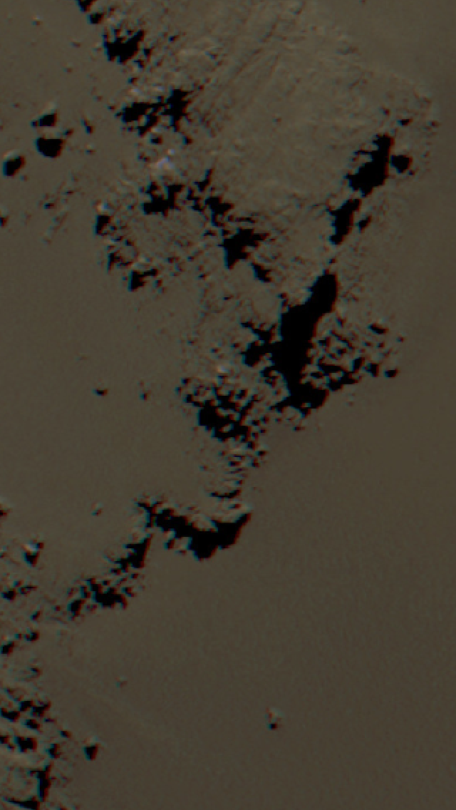
Original from which the header was cropped.

Photo from A. -T. Auger et al. 2015. Copyright: ESA/Rosetta/MPS for OSIRIS Team MPS/UPD/LAM/IAA/SSO/INTA/UPM/DASP/IDA/A.COOPER
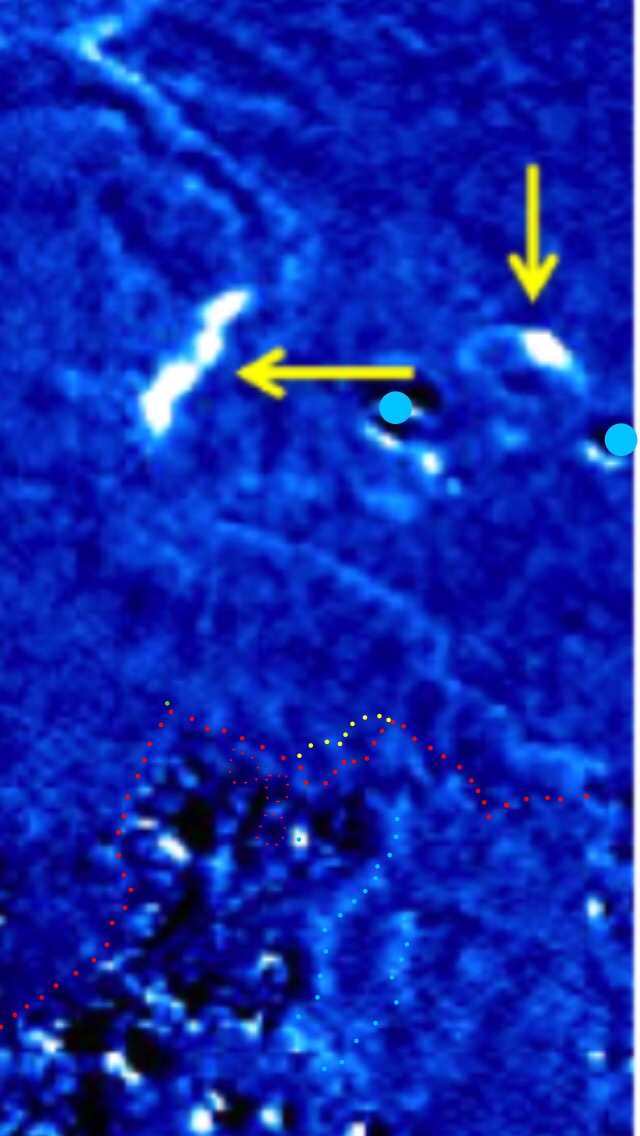
Key:
(Long keys are concluded with ‘/////’ if followed by related discussion).
Yellow- The area B focus as identified in the blog page related to this one. The link to that page is here:
Blue dots- (full zoom required) these are ice signatures. Anything that’s blue or if fainter, a pale mauve colour, is an ice signature. Strong signatures are white. The three blue annotated dots are the three most obvious signatures. The dots are tiny so as not to obscure the actual signatures. The bottom one is next to the bottom yellow dot and to its left. The other two are in a straight line almost directly above it. When you look at the original from a distance you can see them more clearly. It also appears that there may be a faint but lesser signature along the whole perimeter of the cliff against the dust where the focus is. This would be consistent with the reasoning presented for photo 2. The original shows stronger mauve signatures elsewhere on Imhotep so you know what to look for in terms of colour. The colours are paler at the B focus.
Green- this is the tip of the hill that was dotted green in the related page, linked above. This will be a useful fiduciary point when grappling with fuzzier photos, further below.
Red- these are the three ragged squares that were dotted red in the related page. These will also be dotted in some photos lower down as fiduciary points.
Photo 2- the fainter signature on the focus perimeter along the cliff looks as though it’s a continuation of a line of stronger signatures.


Photo from A. -T. Auger et al. 2015. Copyright: ESA/Rosetta/MPS for OSIRIS Team MPS/UPD/LAM/IAA/SSO/INTA/UPM/DASP/IDA/A.COOPER
Red- the signatures along the accumulation basin perimeter. Red dots were chosen as an obvious contrast to the elusive faint mauve signatures they are denoting. It’s best to look at the unannotated version once the red dots have been noted.
Yellow- the future perimeter of the area B focus.
Green- the tip of the triangular hill.
//////
The stronger signatures along the accumulation basin perimeter run for several hundred metres and seem to betray a ridge or scarp that defines the perimeter of the accumulation basin behind the focus. Although the cliff-base part of the focus perimeter is much fainter in terms of an ice signature, that cliff perimeter is in line with the accumulation basin perimeter, suggesting that it’s structurally linked. If that’s the case, the fainter focus signature is likely to be more significant than it appears because the cliff’s structurally related extension into the basin has a relatively strong signature.
THE GROUSSIN ET AL. 2015 PHOTOS
Photo 3, below, is from Groussin et al. 2015, taken on 11th July 2015. For guidance for this photo and photos 4 and 5, these are all crops taken from their figure 2 which is photo 7, near the bottom of this post. Photo 3 is a pure blue/red ratio (481/701 nanometre wavelength) version, that’s not yet blended with its grey context image to form a composite. Photos 4 and 5 are composites. This difference is simply because it happens to be easier to read the pure colour ratio crop for July 11th than its composite version.
Photo 6 is the Groussin et al. figure 1 which gives the full chronology of the Imhotep erosion event in 2015 up to July 11th. Some dates mentioned below refer to ordinary photos (not blue ratio ones) in that figure. The three blue ratio ones do however correspond to three of the dates in the chronology montage. They were probably taken within minutes of their accompanying context photos as seems to be generally the case, looking at OSIRIS time stamps overall. They are minutes apart with an almost indiscernible change in incident angle. That’s because the orbital speed is always substantially less than 1 metre per second and almost all the change would be due to comet rotation anyway (circa two minutes per degree).
Photos 6 and 7 can be used to see the uncropped versions of photos 3, 4 and 5 as well as their context images, dates and incidence angles. All of these things are useful in orientating yourself for what is quite challenging dot interpretation compared with the usual hi-res pictures.
Photos 3, 4 and 5 are in reverse chronological order. This is because we’re trying to identify the ice signature at the B focus and the latest photo of the three is much easier to read than the earliest. However, for understanding the chronological growth of all the areas including area B, it might again be a good idea to keep referring to the figures in photos 6 and 7.
Photo 3- blue/red ratio crop from Groussin et al. 2015 figure 2, dated 11th July 2015. Incidence angle 65°.
From Groussin et al. 2015. Copyright: ESA/Rosetta/MPS for OSIRIS Team MPS/UPD/LAM/IAA/SSO/INTA/UPM/DASP/IDA/A.COOPER
Yellow arrows- these are an original Groussin et al. annotation. They’re not relevant but are nevertheless useful. They point to the area A focus on the left and the area D focus on the right, both of which are white, denoting a strong ice signature.
Red- in this case, red is used in its more usual role as the perimeter of the smooth terrain of Imhotep. But there are also three squares in smaller red dots. These are the same ragged squares as those mentioned above and in the related page.
Green- the tip of the hill for orientation purposes.
Blue- there are two big dots near the yellow arrows: these are the two boulders sitting out on the smooth terrain. They’re not strictly relevant but were dotted blue in the related page. There’s one very small blue dot on a white area next to one of the red squares. This is the strongest ice signature for the B focus. It’s about 50 metres up the cliff from the focus at the cliff base. The two wavy lines of blue dots below the single blue dot should be borne in mind for the next page in this series.
/////
There are two other obvious white signatures along the rocky, red perimeter below the green dot. There may have been a small amount of erosion in the dust below these two before area B got past the green hill tip and consumed this area anyway. It’s difficult to tell but this perimeter doesn’t look quite ‘right’ even on June 5th as compared with much earlier photos. However there always was the faintest of troughs in the dust here, forming a long, thin rectangle against the cliff perimeter. So it could be the lighting enhancing it. Whether lighting or actual erosion, it does seem enhanced between 5th June and supposedly being consumed by area B if it existed at all. And of course, it could have already existed as a vestige from a previous sweep of erosion and so have the same sweep happen in the same manner at the next perihelion hence the apparent confounding of old and new rectangles. This is mentioned since it might be considered strange that the area B focus kicked off from near a strong ice signature whereas the two strong signatures nearby possibly didn’t act as foci. Whether they did or not, it’s a separate argument from the B focus. We can see that the B focus had appeared for sure on June 5th (see linked page above or photo 8).
Photo 4- from Groussin et al. 2015. Composite (colour ratio and context photo blend) taken on June 2nd 2016. Incidence angle 65°.

Photo 4 rotated 90° to give a viewing angle choice to compare with photos 3 or 5.

From Groussin et al. 2015. Copyright: ESA/Rosetta/MPS for OSIRIS Team MPS/UPD/LAM/IAA/SSO/INTA/UPM/DASP/IDA/A.COOPER
Yellow arrow- area A focus.
Two yellow dots against the perimeter- these are the centre points of the two circles that comprise the B focus (see photo 8). The perimeter isn’t shown like it is in the header because too many bright dots can distract in a grainy picture like this.
Red- the rocky perimeter as above (but see ‘dark blue’ as well).
Dark blue- this is also the perimeter, or at least it is, notionally speaking. The upper (more distant) dark blue line runs along the top of a low cliff that’s around 20 metres high. It therefore obscures its own cliff base, i.e. the true perimeter, behind it. The lower, nearer dark blue line runs down the horizon line of the small hill. Rather than being a cliff with the perimeter vertically down behind it, there’s a slope that gently drops down to the yellow focus. The incidence angle we are at means we can almost see over the blue line to the hidden perimeter anyway. However, for readers who are familiar with the general perimeter shape from overhead, along with the ragged squares etc. they would be confused if this horizon line was marked red. They’d be puzzled by the sharp turn and lack of previously given detail. Besides, the blue horizon line is useful to point out because it continues a little further to the right and appears to cut off that white ice signature that can now be seen running down the slope from the main blob at the top and towards the focus.
Light blue- the ice signature which now appears to have an extension going down the slope towards the yellow focus. It appears that the hill horizon obscures its possible further extension down the slope. Although this extension isn’t very apparent in the Auger et al. photo, it seems quite strong here. It’s as strong as the main blob at the top. So did it become more exposed between September 2014 and July 2nd 2015? If so, it would have had to throw off dust during its pre-June 2nd activity so as to expose more pristine ice below. If that’s the case, why does the other Groussin et al photo, above, show just the main blob at the top and no extension? That photo was taken 9 days later on the 11th June and the extension is gone. Meanwhile, the A focus had exhibited the same strong ice signature since 18th June. If anything, it had become stronger. This seems to be evidence that the area B focus had a weaker ice signature than the other areas but it was nevertheless there.
Photo 5- this is the earliest colour ratio/context composite from Groussin et al. 2015. It shows a much smaller area B. It wasn’t presented first because its resolution is lower and the incidence angle was 35°, very low. So it’s harder to read but it’s included here for completeness.

From Groussin et al. 2015. Copyright: ESA/Rosetta/MPS for OSIRIS Team MPS/UPD/LAM/IAA/SSO/INTA/UPM/DASP/IDA/A.COOPER
Key (the dots are small and at the bottom):
Yellow- the centres of the two circles that comprised the B focus. As with photo 4, the full focus perimeter hasn’t been dotted lest it overwhelm what’s already rather difficult to read. The nearer dot is smaller and fainter so as to indicate that this nearer circle was in actuality, mostly out of sight behind the cliff.
Blue- one blue dot sitting to the right of the few white pixels denoting the main ice signature above the cliff. The other two strong signatures to the left and nearer to us are the ones mentioned above and they are some way along the cliff perimeter from the focus B signature. They look close due to foreshortening in this low, 35° view. Incidentally, despite being obvious in the Groussin et al. photos, they’re not apparent in the Auger et al. photo.
Green- the hill tip.
/////
In photo 5, you can see the two isolated boulders beyond the focus, sitting on the smooth terrain. These are useful for orientation. Also, you can see the relatively small area B growing from the focus. It’s the much paler blue lobe. It appears to be growing towards the two boulders but in fact this was roughly its furthest extent in this direction. Soon after this it grew round the green hill tip towards us and up towards middle- left where the A focus is located. Focus A is just off-frame to the left of the left hand boulder.
Photo 6- the chronological montage for the perihelion 2015 erosion on Imhotep from Groussin et al. 2015. The blue ratio photos were taken from this montage or at least were taken at around the same time as three of these photos (see photo 7).

From Groussin et al. 2015. Copyright: ESA/Rosetta/MPS for OSIRIS Team MPS/UPD/LAM/IAA/SSO/INTA/UPM/DASP/IDA/
Photo 7- the blue ratio photos from Groussin et al. 2015.

From Groussin et al. 2015. Copyright: ESA/Rosetta/MPS for OSIRIS Team MPS/UPD/LAM/IAA/SSO/INTA/UPM/DASP/IDA/
Photo 8- the B focus outline. This is the actual incipient erosion at the focus as opposed to the annotation on the Auger et al. photo which shows its future location. It’s formed of two circles that seem to nest into the two semicircles on the perimeter.

From Groussin et al. 2015. Copyright: ESA/Rosetta/MPS for OSIRIS Team MPS/UPD/LAM/IAA/SSO/INTA/UPM/DASP/IDA/A.COOPER
CONCLUSION
This is the middle page of three, linking area B on the smooth terrain to erosion in the accumulation basin behind focus B. The ice signature at focus B is the hypothesised link between the two, kicking off erosion in opposite directions.
