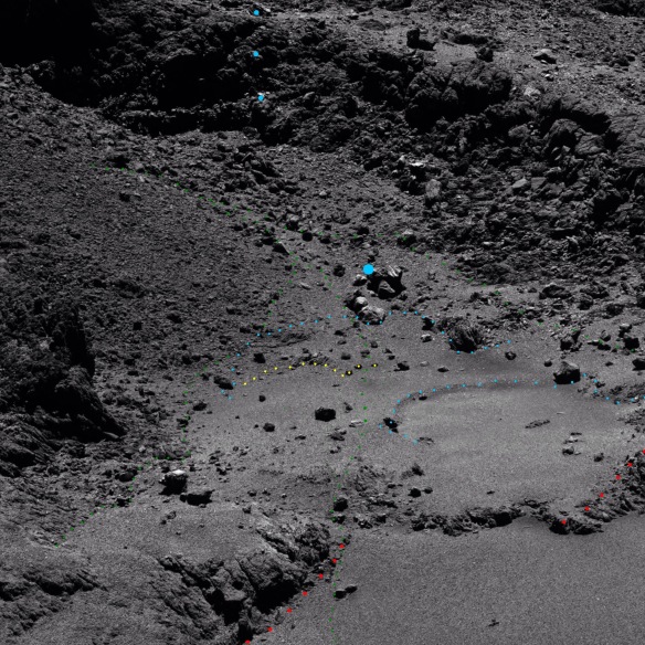
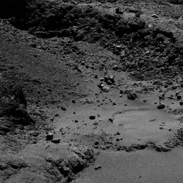
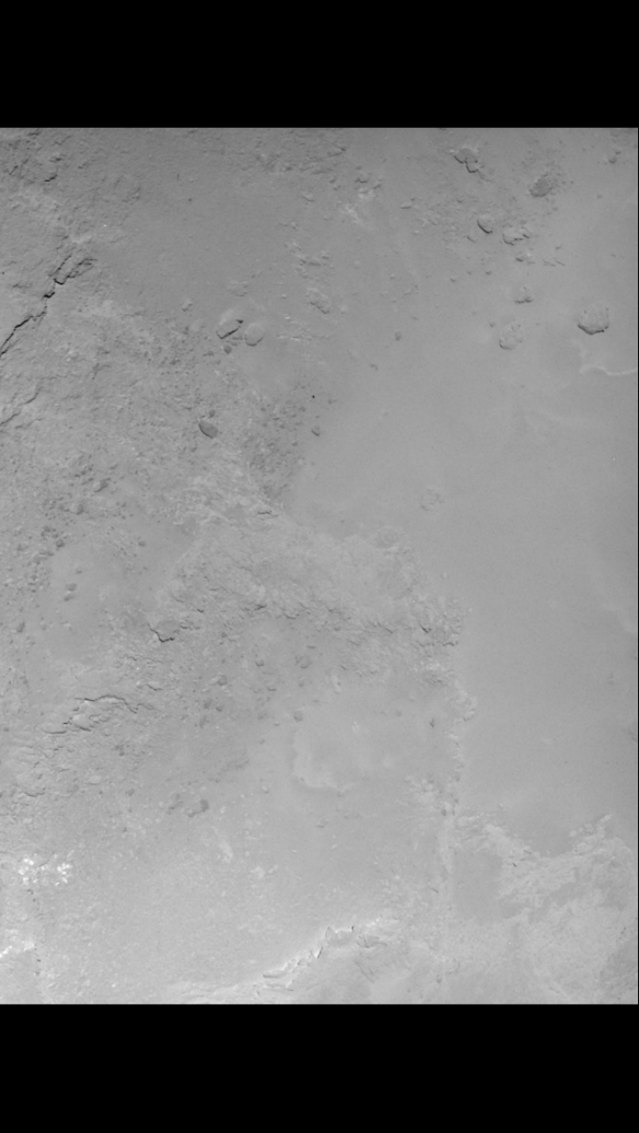
Photos 1 and 2 (photo 3 shows this site in relation to the rest of Imhotep).
Unannotated versions:
Copyright ESA/Rosetta/MPS for OSIRIS Team MPS/UPD/LAM/IAA/SSO/INTA/UPM/DASP/IDA/A.COOPER
Photo 1 was taken just a few days ago on 11th May 2016 and released yesterday. Photo 2 was taken a few weeks ago. Photo 2 is a zero-phase photo meaning that the sun was directly behind the camera and so there was little or no shadowing. Both photos were taken well past perihelion whereas photo 3 was taken well before perihelion. This is useful to bear in mind when considering possible erosion evidence when comparing features either side of perihelion. Erosion has already been documented on Imhotep by Groussin et al. 2015 and it’s much more likely to happen at perihelion. Possible erosion in this more western area of Imhotep is discussed below.
The area of interest in this post is shown as part of the ‘green slide’ in Part 42. Nothing here is new in terms of discoveries as Part 42 shows (although possible erosion is something of a discovery if it is indeed there).
Photo 1 is very recent, taken from only 10km away and has a pixel density of 0.16 metres per pixel. So since it illustrates some of the Part 42 sliding very well, it seems appropriate to do a short page on it. This sliding behaviour isn’t an isolated phenomenon. It dovetails with all the complex sliding that was going on around it on three sides. It’s only a snapshot of the overall picture as described in Part 42.
Key for photos 1 and 2

Copyright ESA/Rosetta/MPS for OSIRIS Team MPS/UPD/LAM/IAA/SSO/INTA/UPM/DASP/IDA/A.COOPER
Green- north-south rift lines. These lines used to be nested over each other. They rifted north-south as the main stretch and sliding on Imhotep continued east and west. These are very small rifts compared with those eastward and westward rifts which were the 700-metre red slide and the 450-metre orange slide (Parts 43 and 45).
Small green (photo 1 only). There are some alternative path lines dotted in smaller green for the main line in the middle. This was a multiple delamination so there are lots of mini rifts. The main one is clearer in photo 3 which is why it was chosen here and indeed it is slightly more obvious than all the rest. There are some isolated green dots to the left of the middle line and smaller lines. These single dots sit on other lines. They aren’t fully dotted due to potential dotting overload detracting from the main theme.
Blue curves- east-west rift lines along the overall long axis stretch vector of the comet.
Large blue- this is the site of one of the jets identified in Vincent et al. 2015. Notice it’s nestled in the crux of the opening between the two rifted ridges (green) as you might expect.
Three blue dots at top- these are the rough positions of the 3 white steps when seen from above in photo 2. They are naturally reflective and not annotated white in that photo.
Yellow- a mini delamination between the two blue curves.
Red- these two ridges used to be nested over each other (and seated against the lip of the depression, 700 metres away. See Part 43: “The Red Slide”. They are red because they are both small portions of the red slide. They are in effect just bent continuations of the green rift lines and seeing as the green lines nested, so did the red ones.
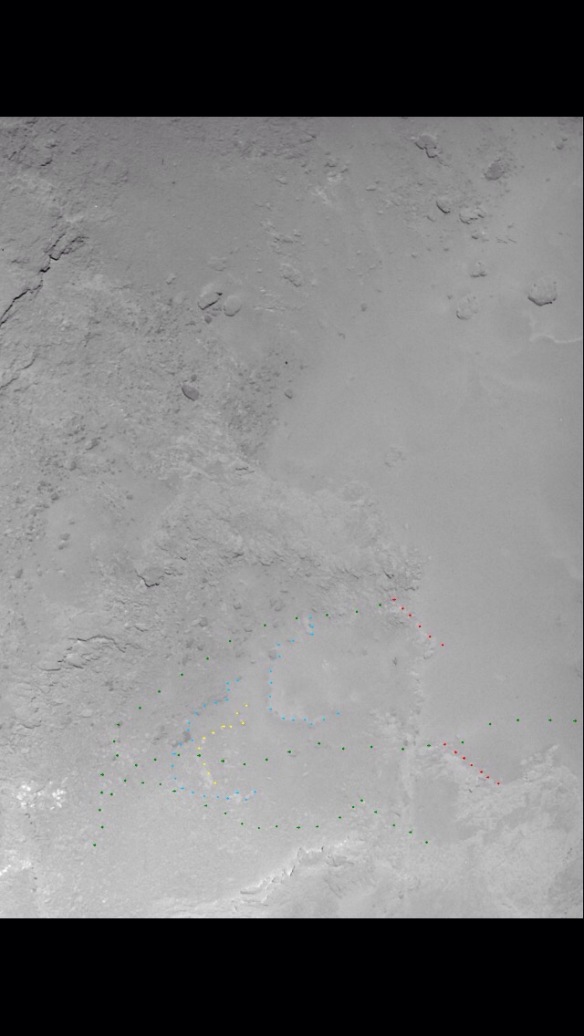
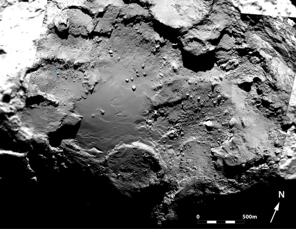
Photo 3- (full zoom needed). This was taken in 2014, before perihelion. It shows the main rift line down the middle of the oval basin better (the area of interest is on the left hand side of the photo). The third green line in photos 1 and 2, that would be below the other two in this view isn’t shown because this photo shows multiple mini terraces in the vicinity of that line. So it’s best to let them speak for themselves.
Photo 3
Copyright ESA/Rosetta/MPS for OSIRIS Team MPS/UPD/LAM/IAA/SSO/INTA/UPM/DASP/IDA/A.COOPER
The key is as for photos 1 and 2. The blue curves aren’t marked. That’s because they’re barely visible. This suggests that either the lighting is different or that they have become substantially more pronounced (i.e. deepened) since perihelion. The blue curve nearest to the main flat area of Imhotep (that is, the curve that is nearest to us in photo 1 and on the right in photo 2 ) has a scarp that resembles the eroded circular features on the main flat area. Those features eroded radially during June and July of 2015, just before perihelion. The steep, curved scarps were the erosion fronts, growing radially. They were 5 metres +/- 2 metres deep. And of course, our blue curve appears to be eroding radially by virtue of being curved. Its scarp looks to be of a similar depth but perhaps a little deeper.
Since our curve is barely visible in photo 3, which was taken in 2014, before perihelion, it suggests that the erosion has become more pronounced. It could just be a trick of the light, smoothing the eroded edge. However, seeing as in photo 2, the sun was directly behind the camera and so casting little or no shadow, you would expect it to ‘smooth’ the eroded edge much more than the (non zero phase) pre perihelion photo 3. The pre perihelion one, though taken from a similar overhead angle, clearly has the sun off to one side, creating shadows. So if the blue curve had a scarp that was as pronounced before perihelion as in the more recent photos 1 and 2, it should have shown up in photo 3. But there’s only the faintest hint of a smooth, wide shadow, implying there was a much smoother, shallower and less pronounced scarp at that time. So it’s possible this curve has eroded over perihelion. You can compare photos 1 and 3 and decide for yourself.
If you’d like to see more solid evidence of erosion see the page entitled “Noticeable Erosion and Subsidence at Anubis”.
UPDATE 24th May 2016:
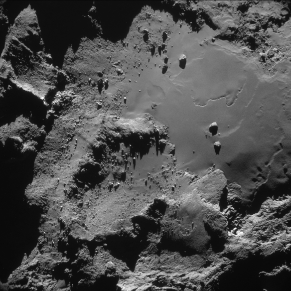
Photo 4-A NAVCAM photo from 14th December 2014, 8 months prior to perihelion.

Copyright ESA/Rosetta/NAVCAM – CC BY-SA IGO 3.0/A.COOPER
To view a copy of this licence please visit:
http://creativecommons.org/licenses/by-sa/3.0/igo/
The reason for showing this photo is that it shows that the lower green line really is a relief feature with different terrain of different smoothness on either side. It also shows a remarkable difference in boulder distribution either side.
The lower green line discussed in the above paragraph is the main green line on the left in the header. That line appeared to be a rather random choice, just slightly more defined than other spidery-thin choices alongside and parallel to it. However, it was chosen because of prior knowledge of that line in this photo and many similar NAVCAM photos.
UPDATE (5th June 2015):
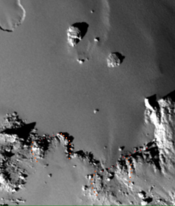
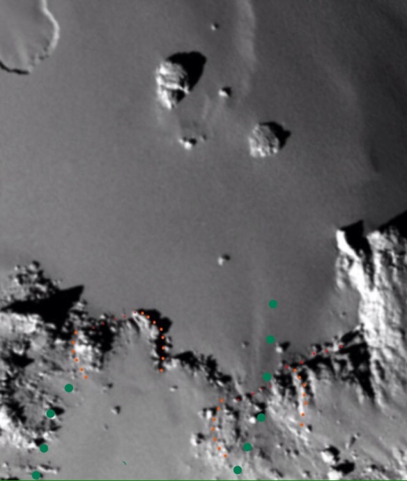
Photo 5- shows the same red rift as in photo 4 but with the exact seating of the rocky area behind it, now idenfied, in orange. Seating on right, slid massif on left. Orange dots are just outside the actual perimeters. It also betrays a tiny mini-rift in the red line.
Copyright ESA/Rosetta/MPS for OSIRIS Team MPS/UPD/LAM/IAA/SSO/INTA/UPM/DASP/IDA/A.COOPER
Photo 6- same as photo 5 but with green rifts added.
Copyright ESA/Rosetta/MPS for OSIRIS Team MPS/UPD/LAM/IAA/SSO/INTA/UPM/DASP/IDA/A.COOPER

